
2026
DONGNAN VILLE VI design
Entrant
B+ design/ Bian Yan/ Qian Meng/Chang Shuo/Liu Zhuqing/Ren Zuoli
Category
Communication Design - Communication Design - Logo Design
Client's Name
-
Country / Region
China
Gallery

About The Entry
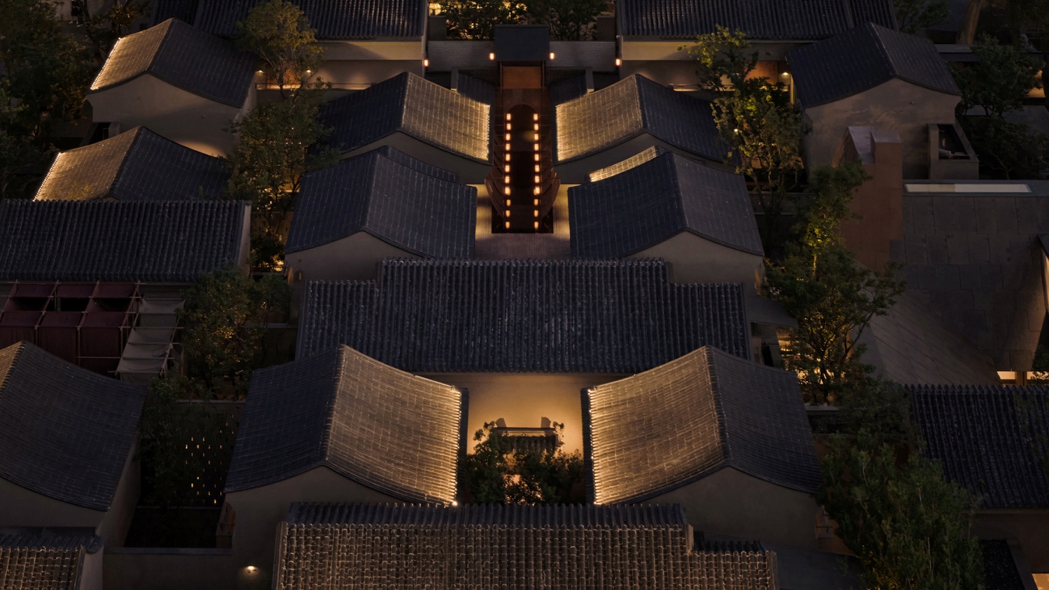
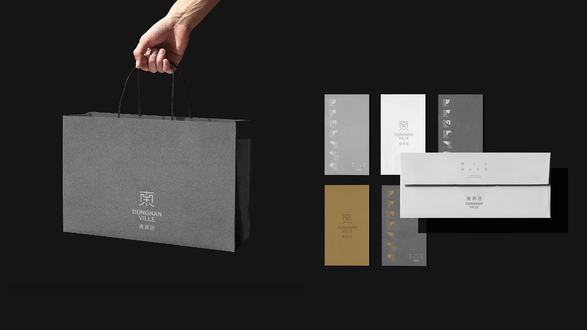
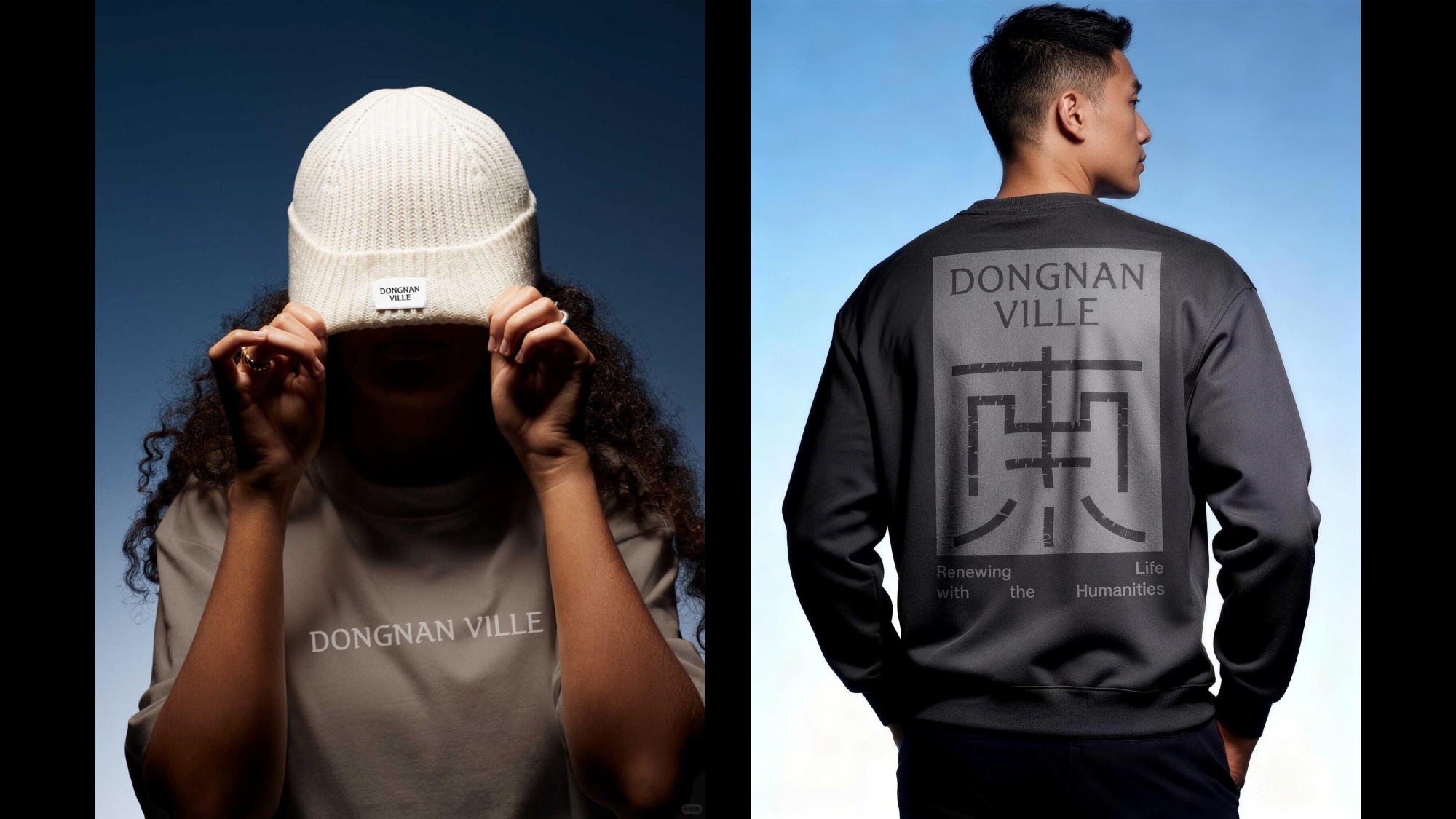
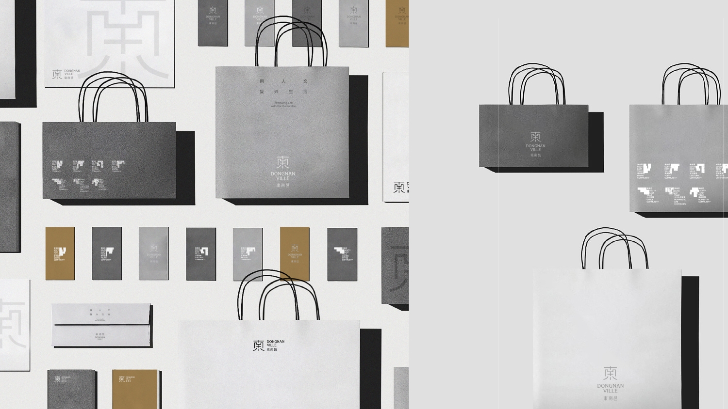
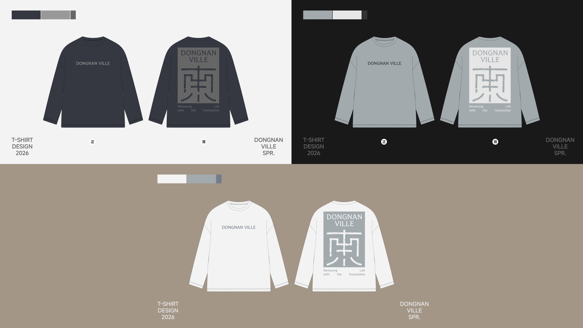
Dongnan Ville is a historic and cultural neighborhood within the ancient city of Datong in Shanxi, China. Over time, it has evolved from a physical space into a lifestyle brand that combines comprehensive commercial services, boutique high-end hotels, culture, and art. VI represents the concentrated expression of the brand's spirit, spatial character, and lifestyle. It gives Dongnan Ville a clearer aesthetic expression and allows the humanistic qualities embedded in its streets, courtyards, buildings, and daily life to be newly recognized.
We draw inspiration from Dongnan Ville's local roots, going deep into the texture of 'streets—settlements—home.' We extract and translate elements from the order of streets, the forms of settlements, and the imagery of homes, so the visual system becomes an internal expression of Dongnan Ville's lifestyle.
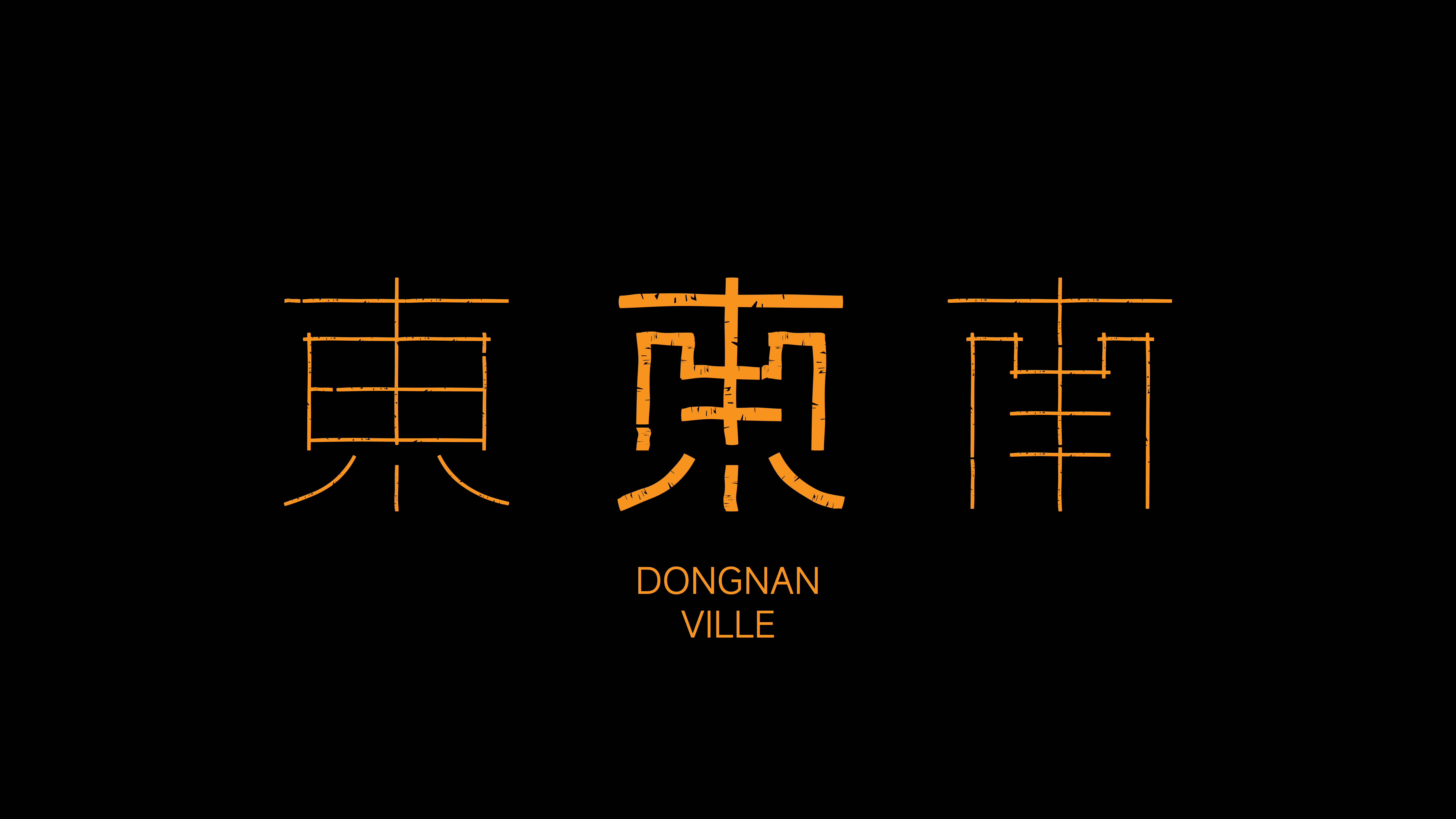
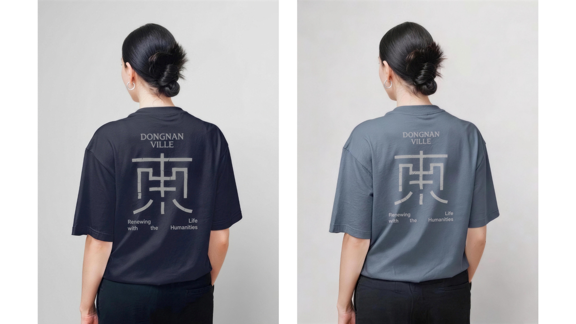
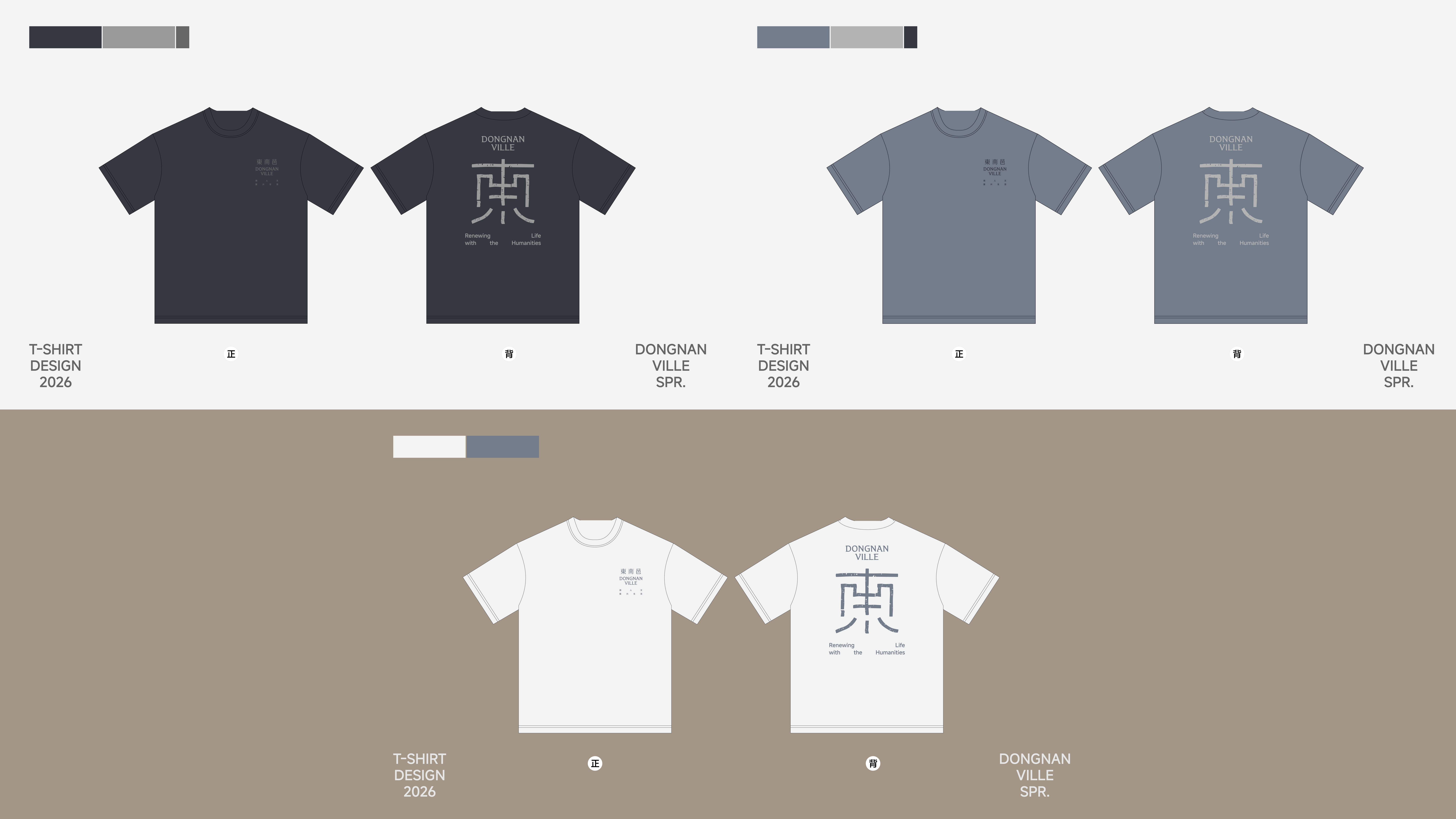
The core of the design lies in the structures of the Chinese characters for 'East' (东) and 'South' (南)—order is established between horizontal and vertical strokes, movement forms between slanted strokes, and enclosed areas hint at space. These characters carry meaning and convey an Eastern understanding of order and beauty.
When 'East' and 'South' are deconstructed, contrasted, enclosed, and recombined, the two characters transform from form into space. The overlaps in strokes resemble intersecting streets; the enclosed structures evoke courtyards; the establishment of a central axis reflects the aesthetic tradition of balance and symmetry in Eastern spaces.
The resulting 'East-South combined character' possesses both textual and graphic qualities. It keeps the name recognition of 'Dongnan,' while condensing imagery like streets, courtyards, and gatherings into a unified symbol. It is like a seal imprinted from the ancient city’s texture or a miniature map of the neighborhood. Within this small space, there are boundaries, blank areas, and possibilities for life to continue entering.
Credits

Entrant
Office of Fields
Category
Communication Design - Company Branding
Entrant
Guang dong Jinlong Industrial Co., Ltd.
Category
Product Design - Lifestyle

Entrant
Nanchang Zhener Trading Co., Ltd.
Category
Product Design - Personal Care
Entrant
Shiseido China
Category
Interior Design - Exhibits, Pavilions & Exhibitions