
2026
Tree-Tarianism Nuts Packaging Design
Entrant
ChaCha Food Co.,Ltd
Category
Packaging Design - Snacks, Confectionary & Desserts
Client's Name
-
Country / Region
China
Gallery





About The Entry
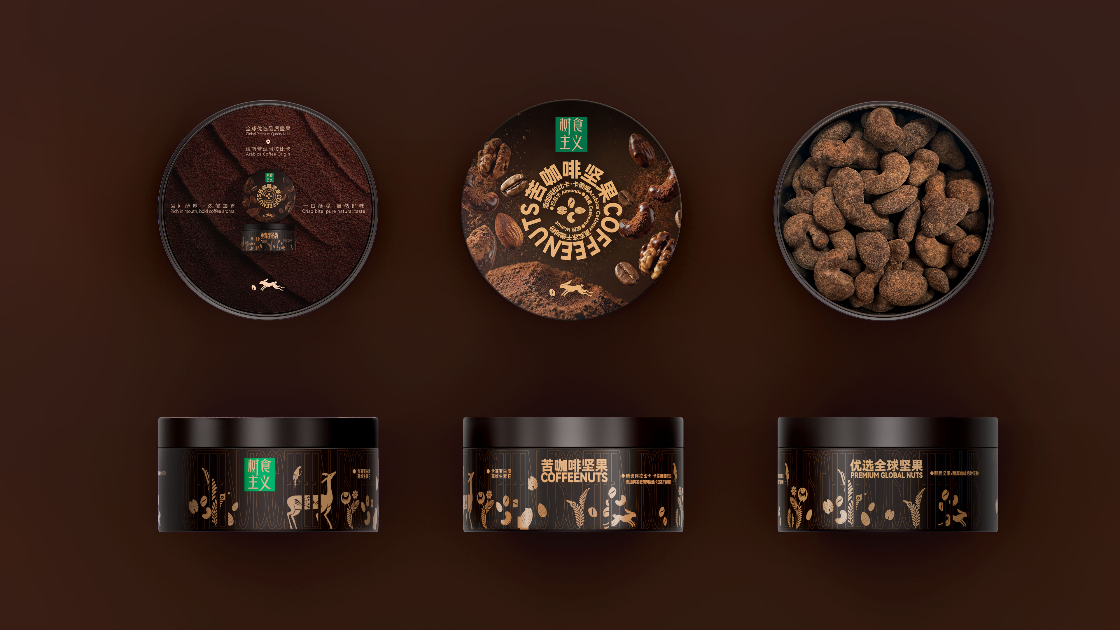
The packaging design for Chacha's Tree-Tarianism Nuts Packaging Series takes the "tree" as its form, "food" as its essence, and "classical aesthetics" as its soul. The design translates the brand's core concept of "Tree-Tarianism"—a natural philosophy asserting that "healthy food originates from trees"—into a complete and rigorous visual language. Every bean and nut grows on the branch; every can and flavor is a gift from the tree.
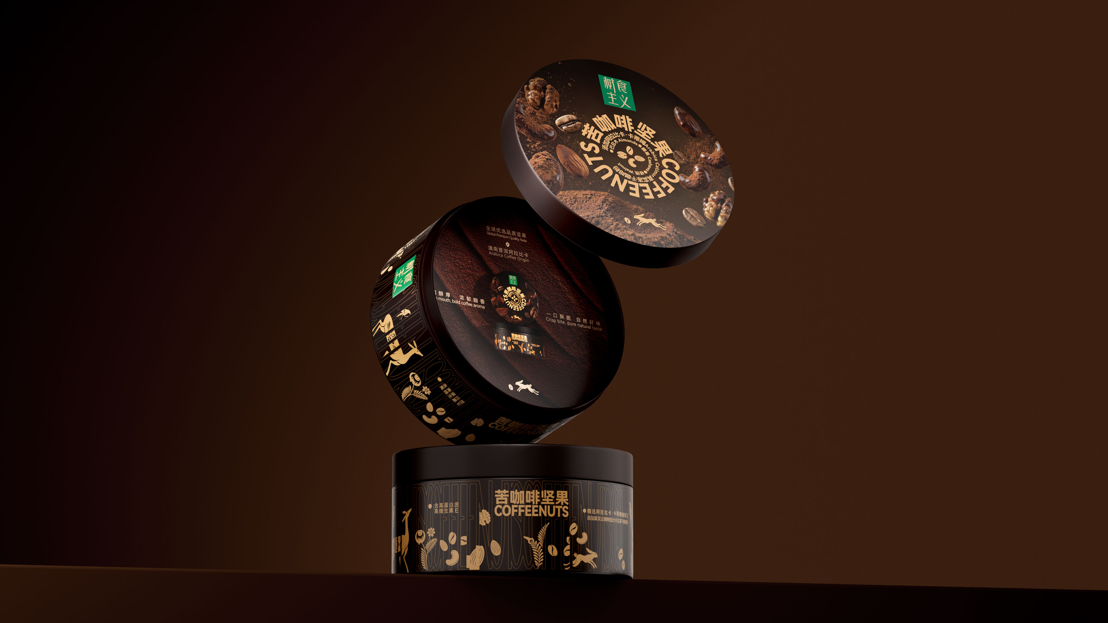
The overall visual system revolves around the morphology of a "tree." The top lid features a concentric circular layout, simulating the annual rings of a tree's cross-section: the center displays the product names "COFFEENUTS" and "WHITENUTS", while the outer rings sequence the ingredient origins and crafting processes, creating a centripetal reading flow.
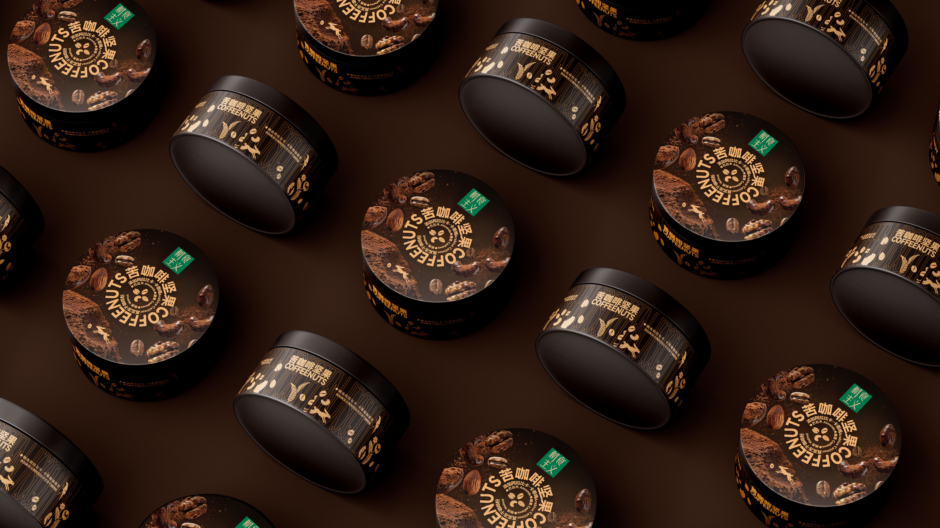
The canister's facade transforms the all-cap letters of "COFFEENUTS" and "WHITENUTS" into a continuous linear pattern, with its rhythm and density mimicking the texture of tree bark. It seamlessly integrates flora and fauna graphics such as deer, birds, branches, and fruits, presented in the ancient Greek red-figure pottery style. The tree rings on the top and the trunk on the side connect naturally in spatial dimensions to form a complete, abstract tree, intuitively expressing the brand philosophy that "coffee and nuts are born from trees, while SA(sialic acid) captures the spirit of nature."
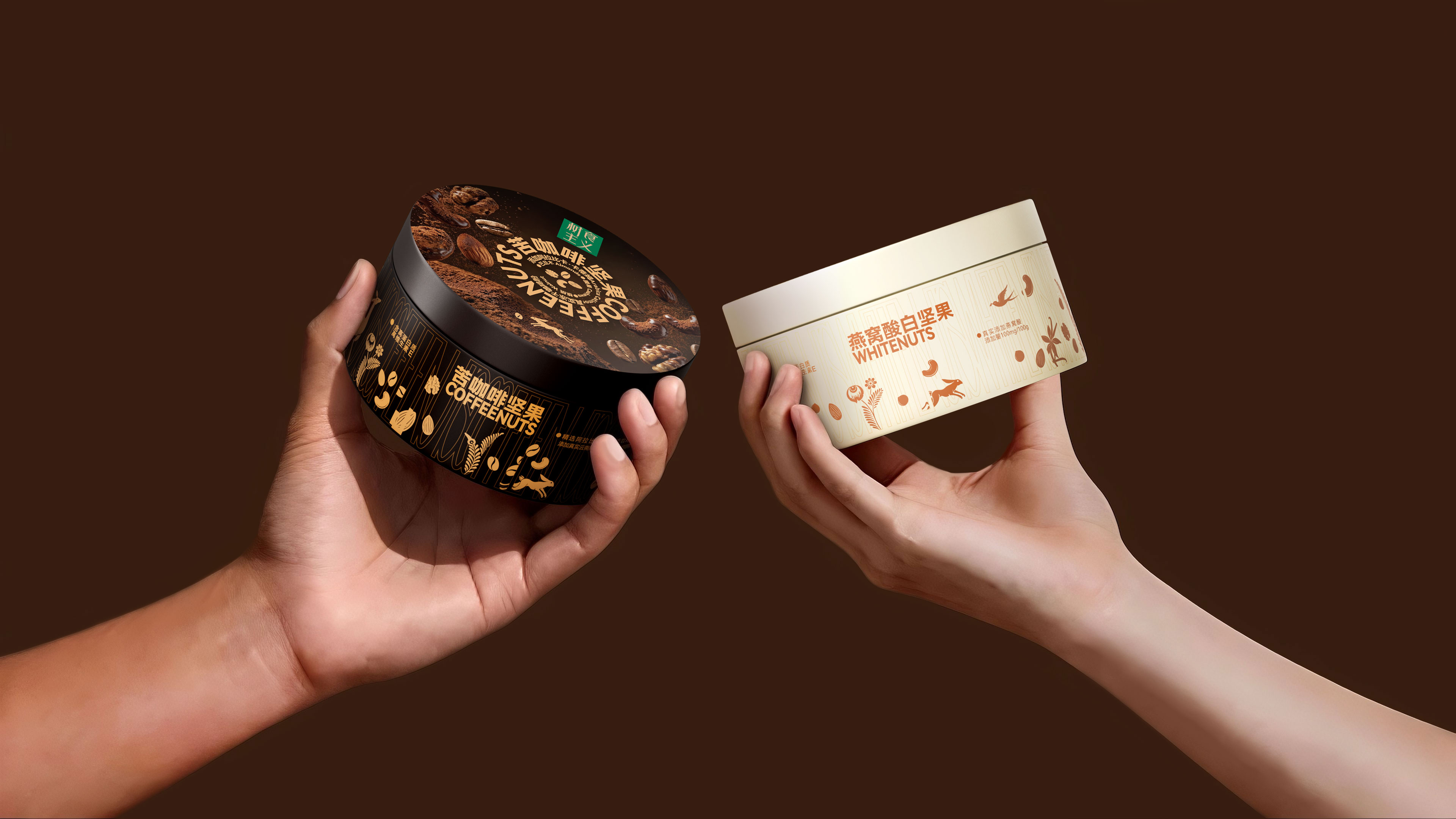
For the "COFFEENUTS", the colors are derived from the natural mineral palette of ancient Greek pottery, with terracotta brown, olive green, and matte gold as the primary tones. Conversely, the "WHITENUTS" packaging adopts the natural pure white of bird's nests as its main tone, symbolizing immaculate quality and a precious essence sourced from nature, thereby creating an elegant and gentle visual ambiance. The overall design eschews high-saturation colors, utilizing muted earth tones and pure color palettes to create a serene, rustic, yet noble visual atmosphere.
The graphic language employs single-line sketching and negative space, echoing the hand-painted motifs found on classical pottery. This minimalist yet orderly linear expression imbues the packaging with a primitive, handcrafted feel while demonstrating the clarity and restraint of modern design, thereby breathing new life into classical aesthetics within a contemporary context.
Entrant
Guangzhou Shanchi Cultural Creativity Co., Ltd.
Category
Fashion Design - Jewelry

Entrant
Zefeng Lu
Category
Product Design - Pet
Entrant
Shenzhen Root Innovation Technology Co., Ltd.
Category
Product Design - Baby, Kids & Children Products