
2026
Crispy Asian
Entrant
Creatives Data
Category
Communication Design - Company Branding
Client's Name
Crispy Asian
Country / Region
Turkey
Gallery

About The Entry
Crispy Asian is a vibrant culinary manifesto designed to capture the electric pulse of the modern city. Guided by the slogan "The Far East of the City" our branding vision reimagines the rich heritage of Chinese, Japanese, and Southeast Asian cuisines as a dynamic, urban lifestyle event. We purposefully stepped away from the quiet, reserved aesthetics often found in this category to create a "Pop Art" infused universe that feels loud, confident, and unapologetically modern. The project is an exploration of cultural remixing, where the ancient mystique of the Far East meets the high-speed rhythm of contemporary street culture to represent a destination for those who crave authenticity.
In this universe, the concept of “Crispy” is treated not merely as a reference to taste, but as a metaphor defining the brand’s energy and distinctive rhythm. The graphic language utilizes sharp, balanced forms to create a dialogue between traditional Asian aesthetics and contemporary design. At the center of this visual narrative stands the Kirin, a mythological symbol of purity and good fortune. It is accompanied by a series of bespoke, woodcut-style characters including a powerful Dragon, a stoic Panda, and a dynamic Tiger which represent values such as strength, wisdom, and courage. These mascots are rendered with a grit that evokes craftsmanship, yet they are presented within a layout that screams high fashion boldness, developed as a modular system for flexible use across all surfaces.
The color palette plays a crucial role in this sensory experience. Inspired by the fundamental elements of the cuisine referencing the deep tones of soy sauce, the heat of spices, and the freshness of seafood we employed a spectrum of high-contrast, saturated hues that radiate warmth and vitality. This visual intensity ensures that every interaction sparks excitement. The packaging itself is designed to be a "Gift" turning a simple meal delivery into a moment of discovery. By blending witty messaging with bold graphical courage, Crispy Asian creates a sense of belonging for the modern urbanite, delivering a cohesive brand experience that feels right at home in the heart of the city.
Entrant
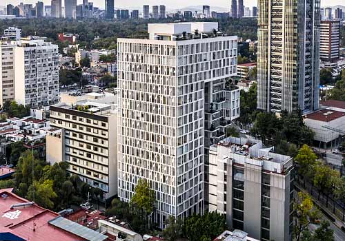
BRAG Arquitectos + GDC Desarrollos
Category
Architectural Design - High Rise Buildings

Entrant
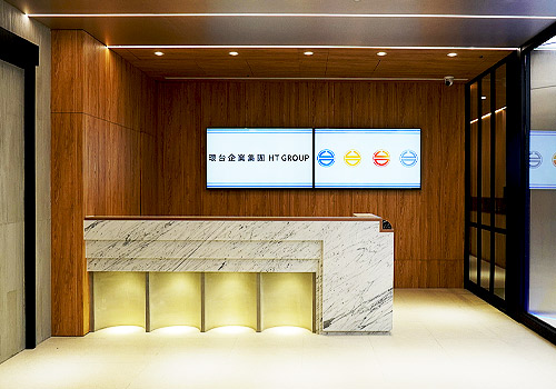
HWAN TAI GROUP / UETERNITY
Category
Interior Design - Office