2025
Jasmine Series
Entrant
VIBERT(Guangzhou )cosmetics Co. Ltd.
Category
Packaging Design - Cosmetics & Fragrance
Client's Name
Country / Region
China
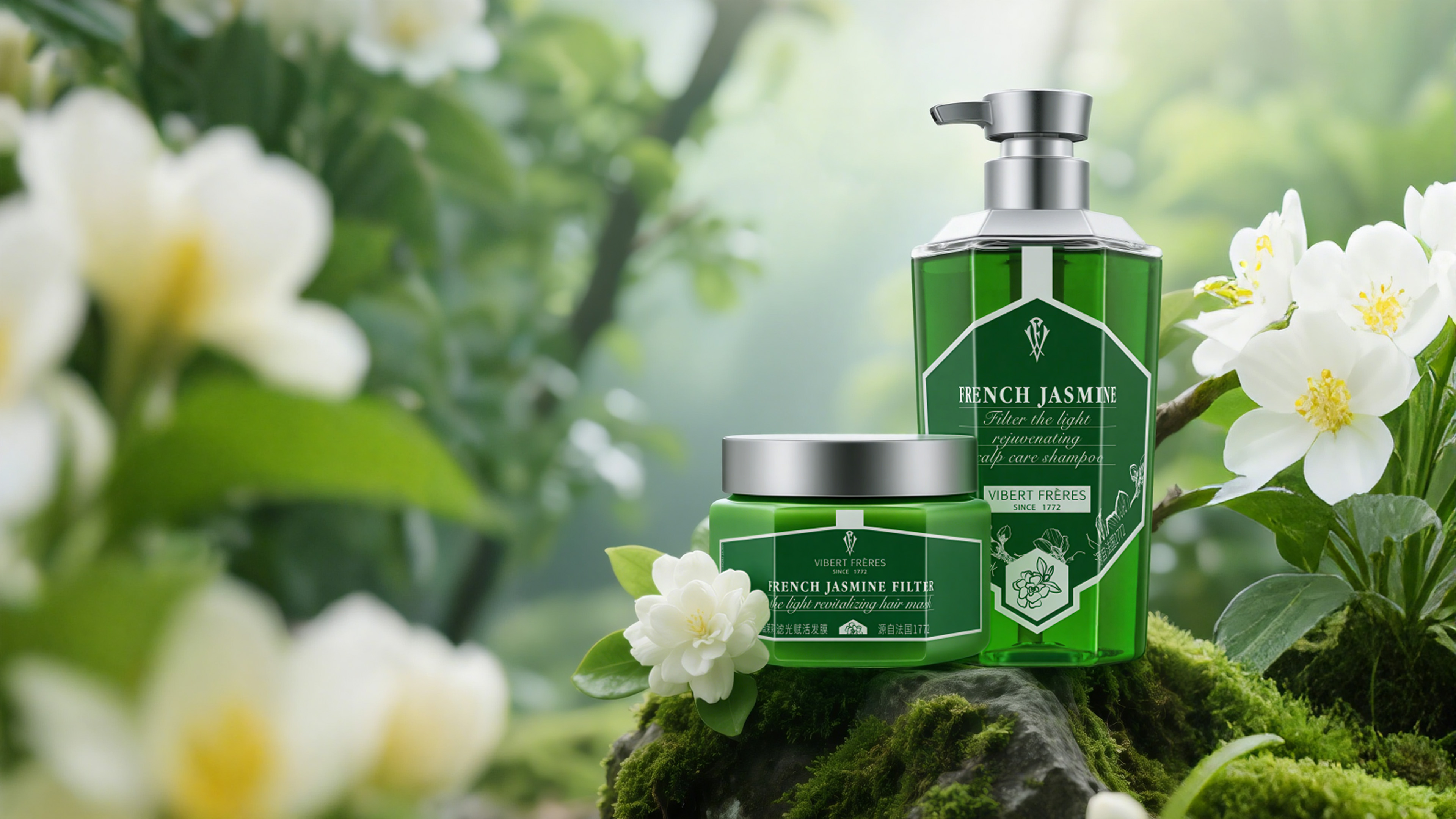
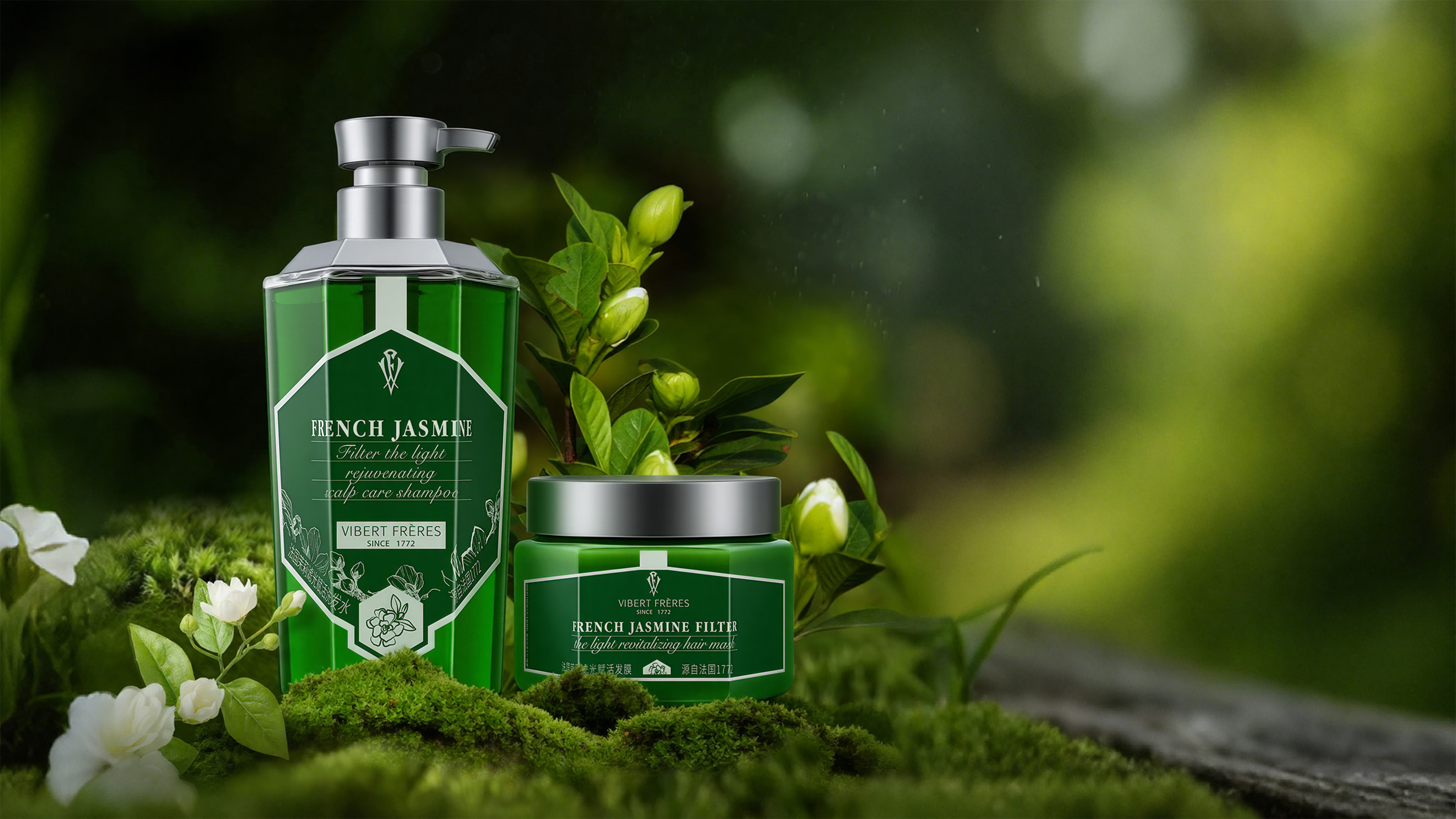
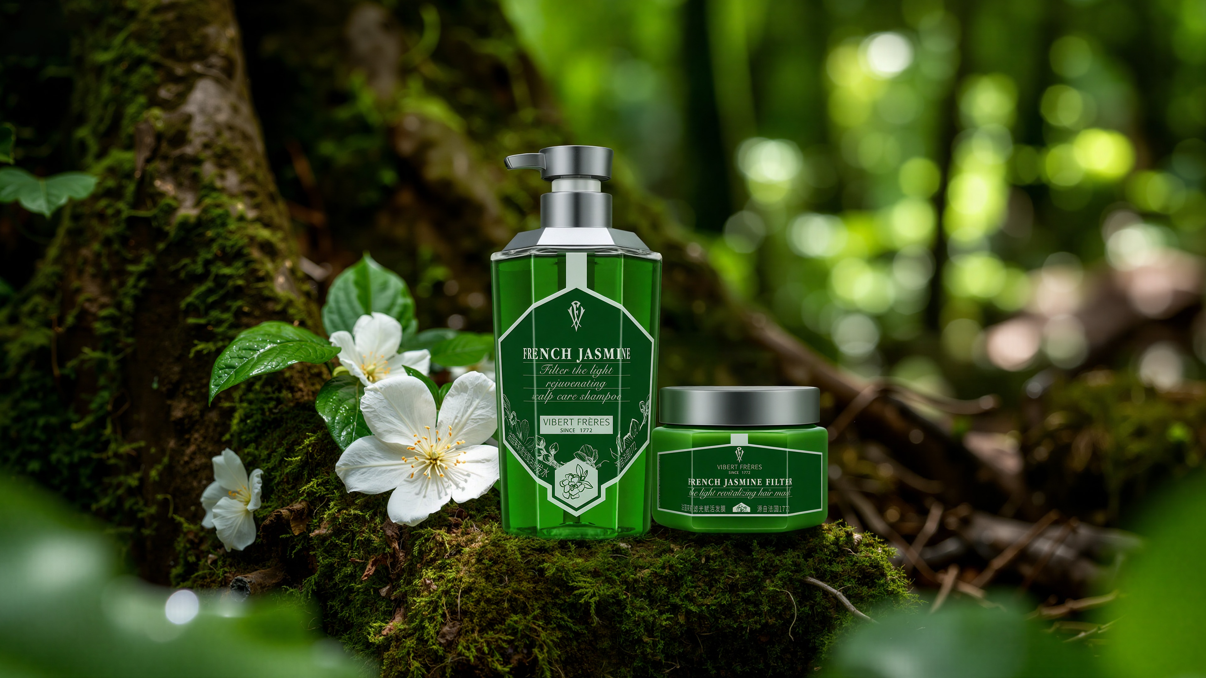
The design is inspired by a fleeting moment at dawn in the Gardens of Versailles, as the first rays of sunlight illuminate dew-kissed jasmine petals. We sought to capture not just a fragrance, but the very essence of this moment—the pure vitality born from the interplay of light, flora, and morning dew.
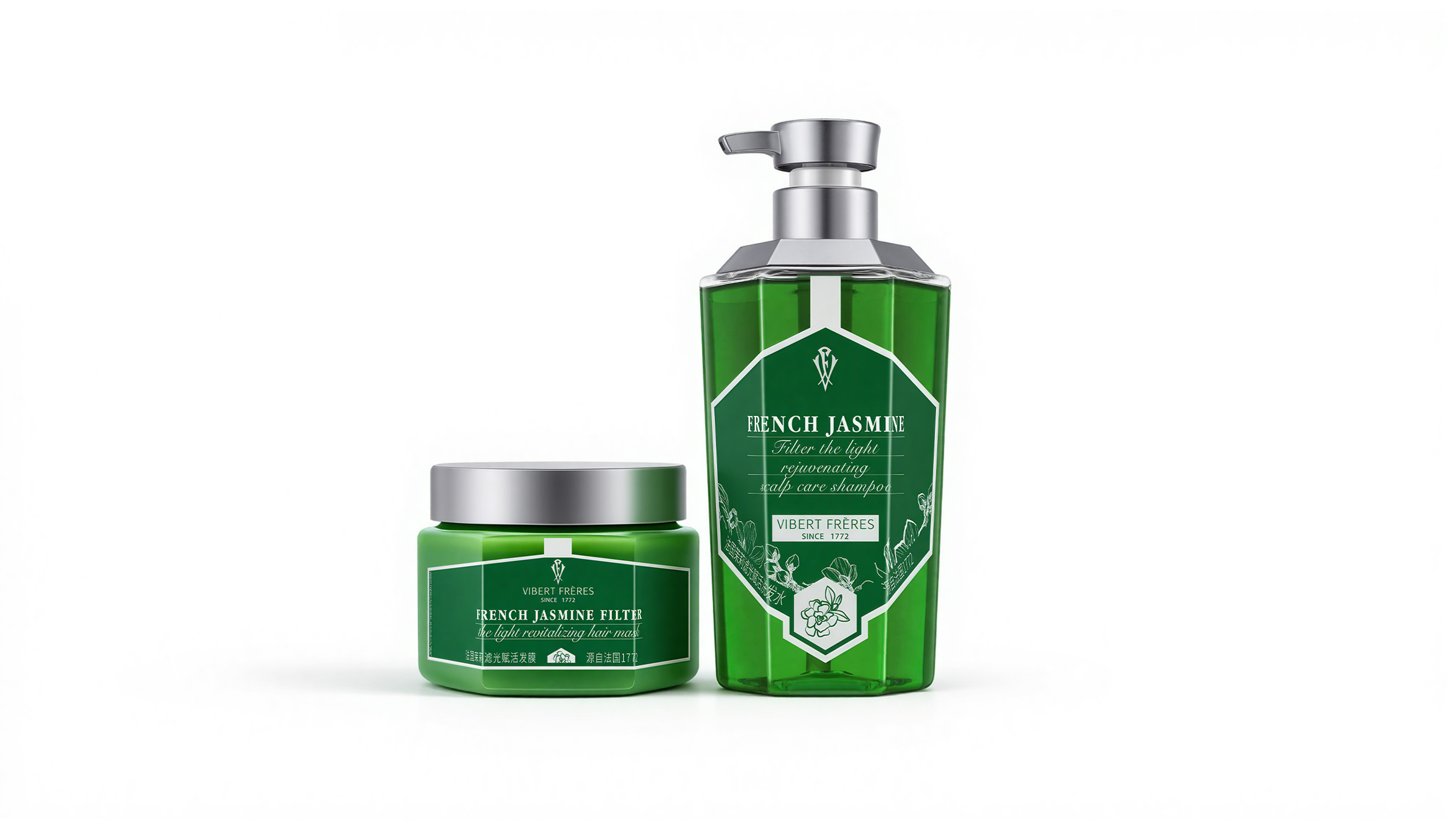
Garden Geometry: The hexagonal prism bottle draws inspiration from the geometric order of French gardens. Each facet acts as a viewfinder, refracting light to imbue the static form with a dynamic, flowing vitality.
Classical Apothecary Aesthetics: Honoring our heritage dating back to 1772, the design borrows from the form of classic European apothecary jars. This evokes a sense of scientific professionalism and trust, symbolizing a jasmine restorative formula perfected over time.
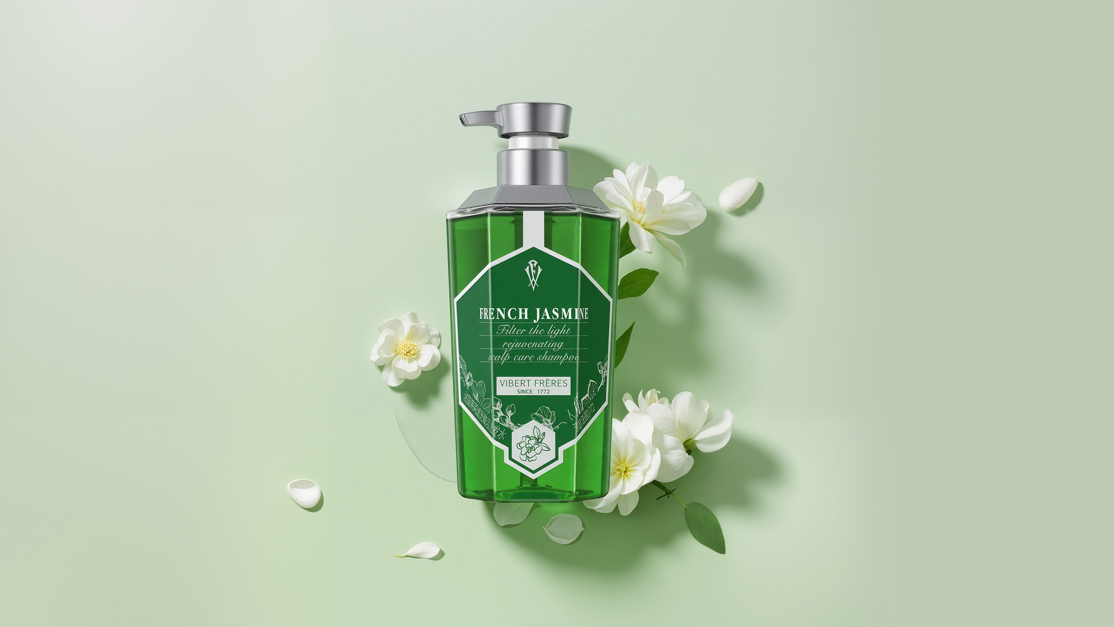
Fusion of Eastern Aesthetics: Centered around the "Oriental Fairy" jasmine, the bottle is adorned with a modern floral totem in a line-drawing style. This incorporates the gentle rhythm of negative space found in ink wash painting, creating a harmonious dialogue between Eastern fluidity and Western geometry for a captivating cross-cultural appeal.
The primary color of the series is a deep, vibrant emerald green, symbolizing nature, botanicals, and purification. It precisely communicates the oil-controlling and clarifying efficacy of the jasmine essence. This highly saturated hue, distinct from common pale greens, underscores the product's premium and high-performance positioning.
The transparent body reveals the purity of the liquid within, while the matte silver cap and pump introduce a cool, technological feel. This hints at the backing of patented formulas like "Saccharomyces Ferment Filtrate," creating a seamless fusion of nature and science.
The bottle's dimensions—its angles, width, and height—have been meticulously engineered for ergonomics. It ensures a comfortable and secure grip for any hand, regardless of gender. The pump's travel distance and dispensation volume have been rigorously tested to guarantee a smooth, precise, and effortless user experience.
The label design eschews complexity. A vast canvas of the signature green serves as a backdrop, accentuating the exquisite brand logo and an elegant French serif typeface.This minimalist approach not only enhances the product's luxurious character but also makes key information instantly clear.
Credits
Entrant
Inner Pattern Club by Beam Ker
Category
Communication Design - Character Design


Entrant
Freelance
Category
Architectural Design - Museum, Exhibits, Pavilions


Entrant
OceanLung
Category
Conceptual Design - Education
