
2025
Visual Identity Design of Preparatory Office of NMIP
Entrant
DOES Visual Design Studio
Category
Communication Design - Public Branding
Client's Name
COUNCIL OF INDIGENOUS PEOPLES
Country / Region
Taiwan
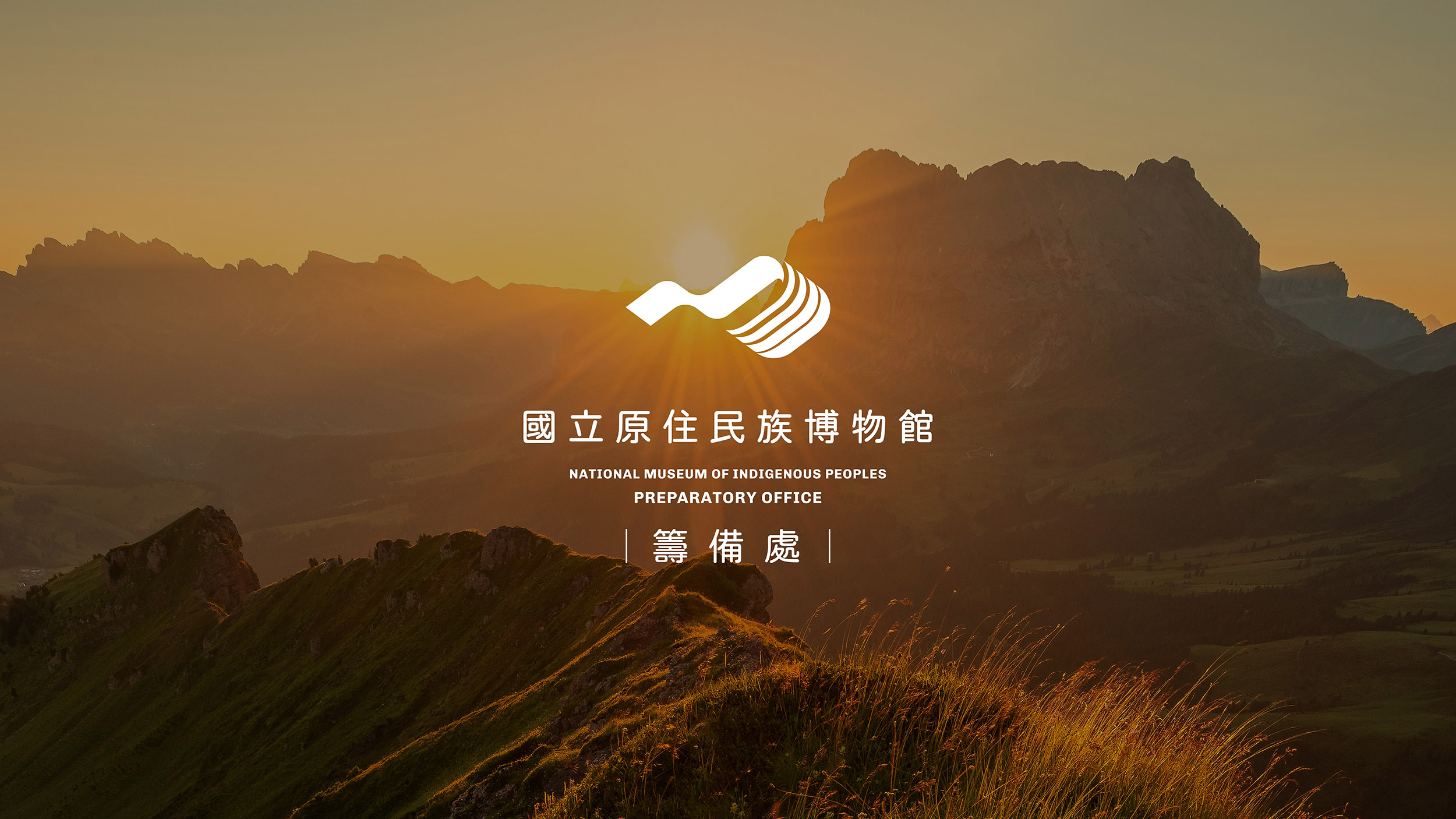
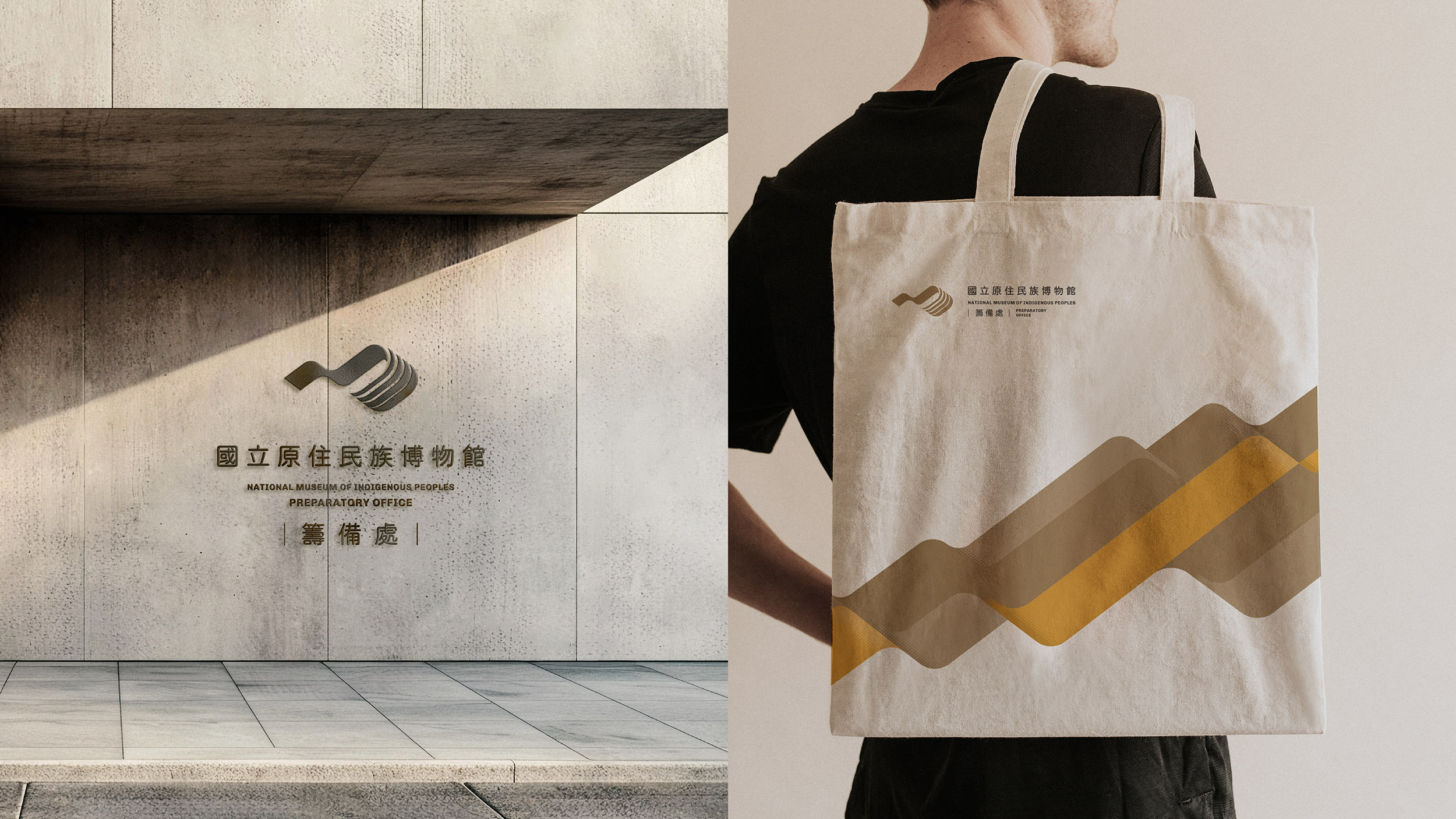
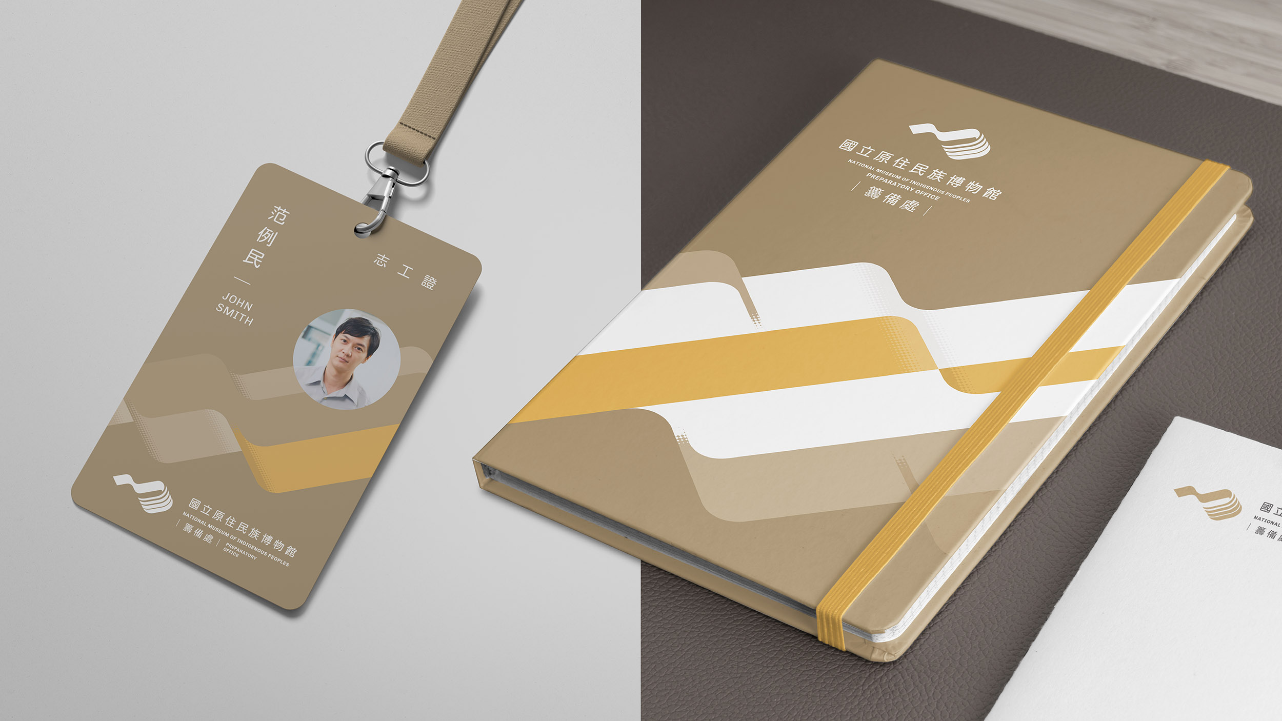
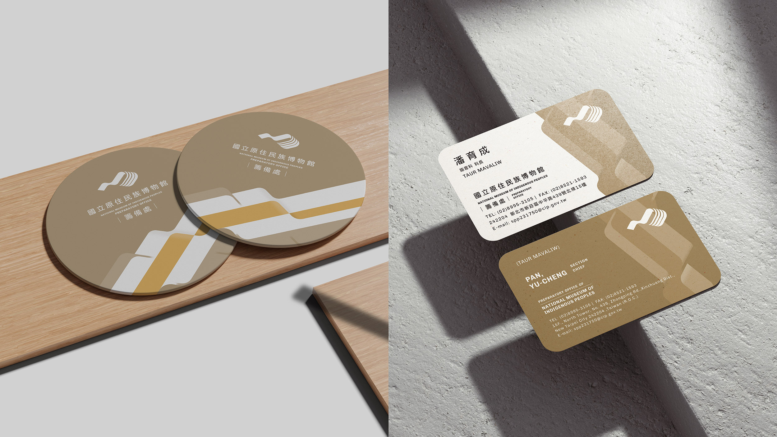
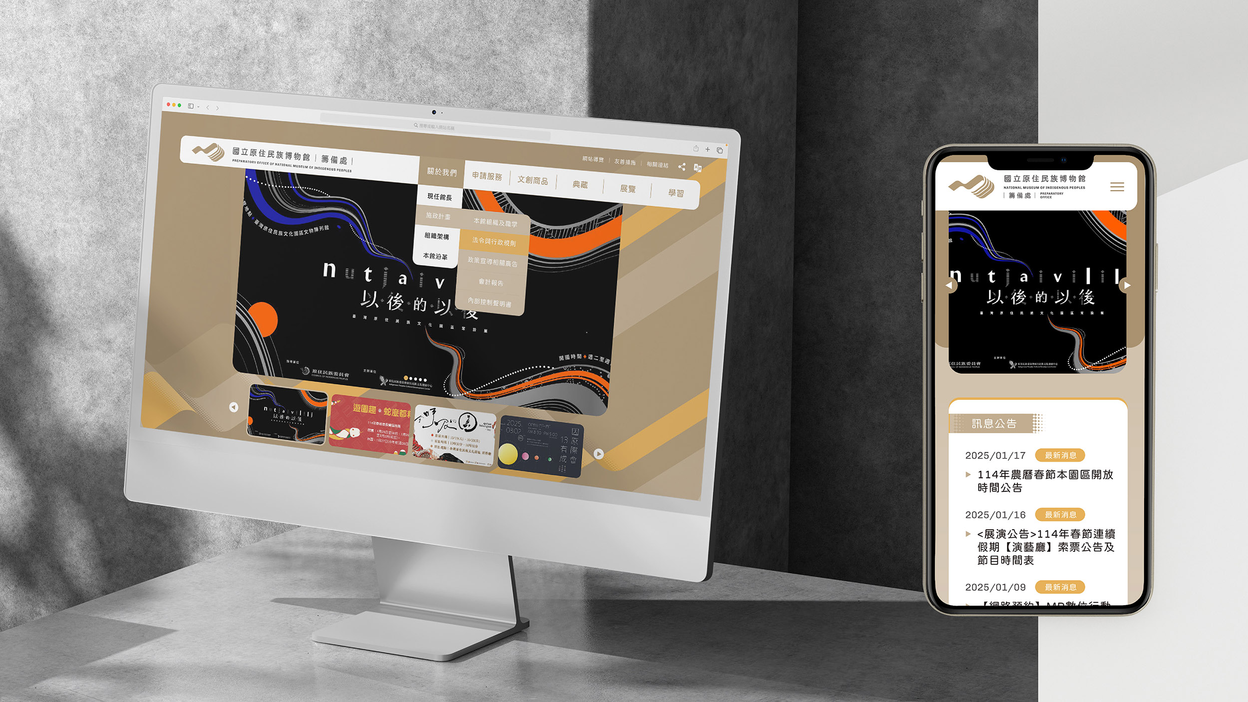
The identity of the National Museum of Indigenous Peoples, expressed through the acronym “MIP,” is more than a mark. It is envisioned as a symbol of modernity and international dialogue, positioning the museum as a cultural bridge that connects Taiwan with the wider world. The design communicates a global visual language while affirming the museum’s mission to foster knowledge exchange, mutual respect, and cultural co-creation.
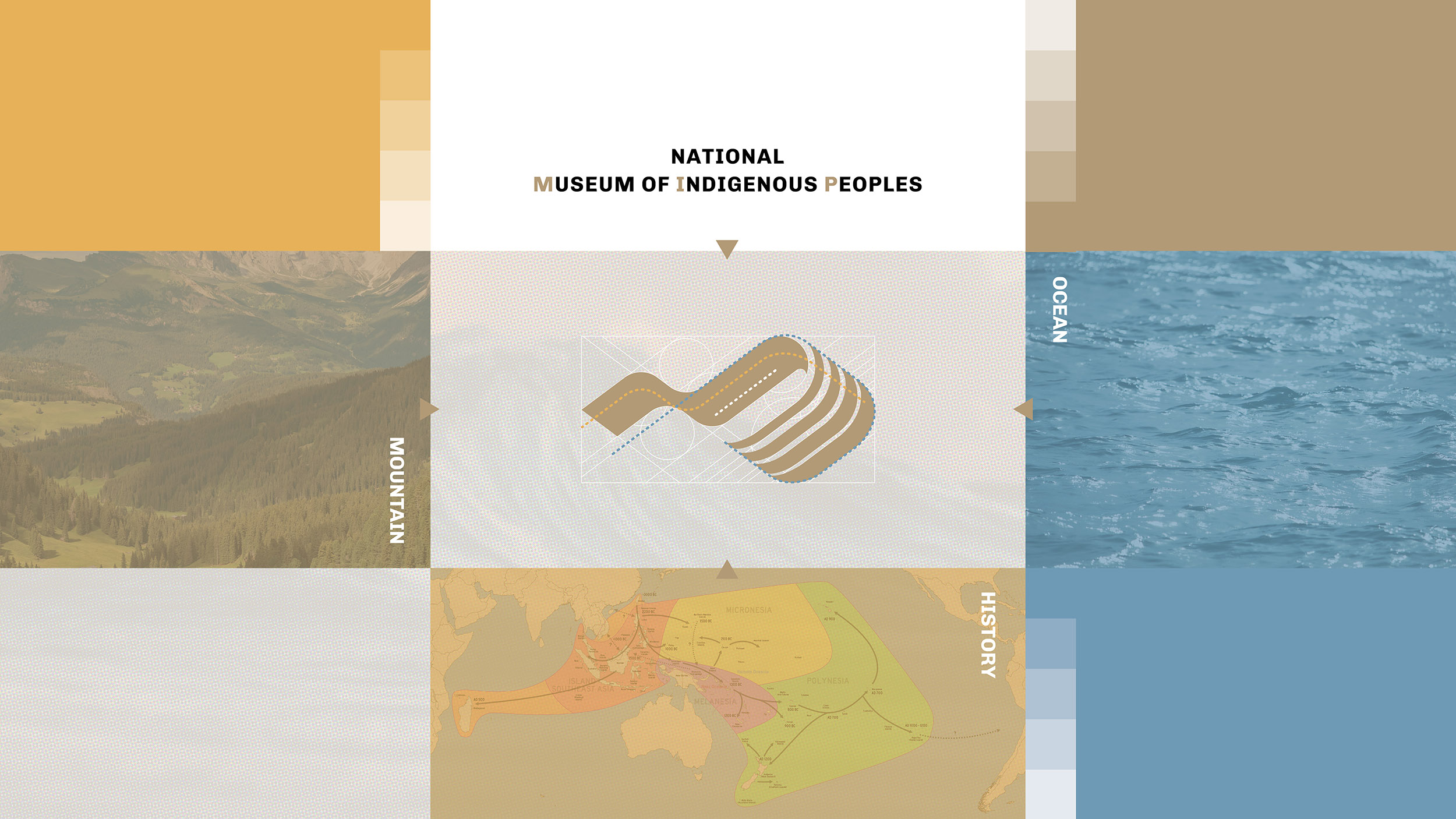
The inspiration derives from the Austronesian migration map, which traces routes beginning in Taiwan and spreading across the oceans. This imagery underscores Taiwan’s role as the cradle of Austronesian cultures, while the extended paths represent the historical influence and contemporary vitality of Indigenous contributions worldwide.
The design integrates imagery of mountains and seas, rendered in flowing lines that symbolize the intimate relationship between Indigenous peoples and nature. Mountains embody stability and rootedness, while seas suggest openness and inclusivity. Together they reflect resilience, balance, and the philosophy of coexistence, pointing toward a sustainable vision for the future.
Within the structure of the logo, four strands signify four cultural groups: Taiwan’s Indigenous peoples, the Plains communities, the greater Austronesian family, and other Indigenous nations across the globe. Their interwoven lines represent dialogue and collaboration, visualizing the museum’s role as a platform for intercultural exchange and solidarity.
The overall form recalls a traditional woven textile, unfurling in the wind. The texture and rhythm of weaving express continuity, resilience, and the carrying of ancestral memory into a contemporary context. The fabric’s movement symbolizes cultural stories extending outward, binding history, present, and future into a living narrative.
Ultimately, MIP embodies a museum of both memory and possibility. From Taiwan as a starting point, it invites audiences to participate in an ongoing global dialogue of Indigenous heritage. Here, history and future intertwine, culture and nature coexist, and every space becomes a meeting ground where voices, traditions, and aspirations converge to envision a shared and hopeful cultural future.

Credits


Entrant
China Mobile Software Technology Co., Ltd
Category
User Interface Design (UI) - Web Applications / Services
Entrant
University College London
Category
Architectural Design - Urban Design

Entrant
CLV.DESIGN
Category
Interior Design - model room