2025
CRUSH HUB
Entrant
Niice Design
Category
Communication Design - Company Branding
Client's Name
-
Country / Region
China
Gallery
About The Entry
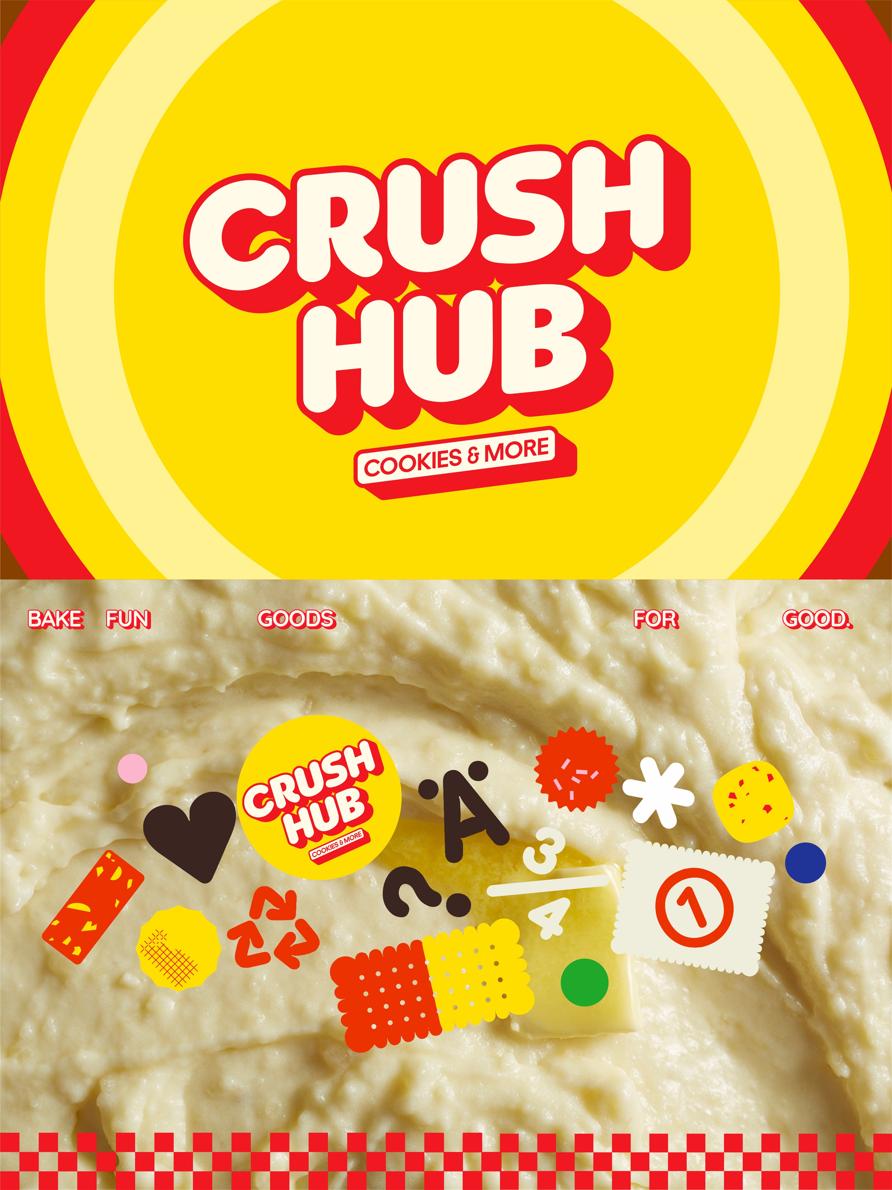
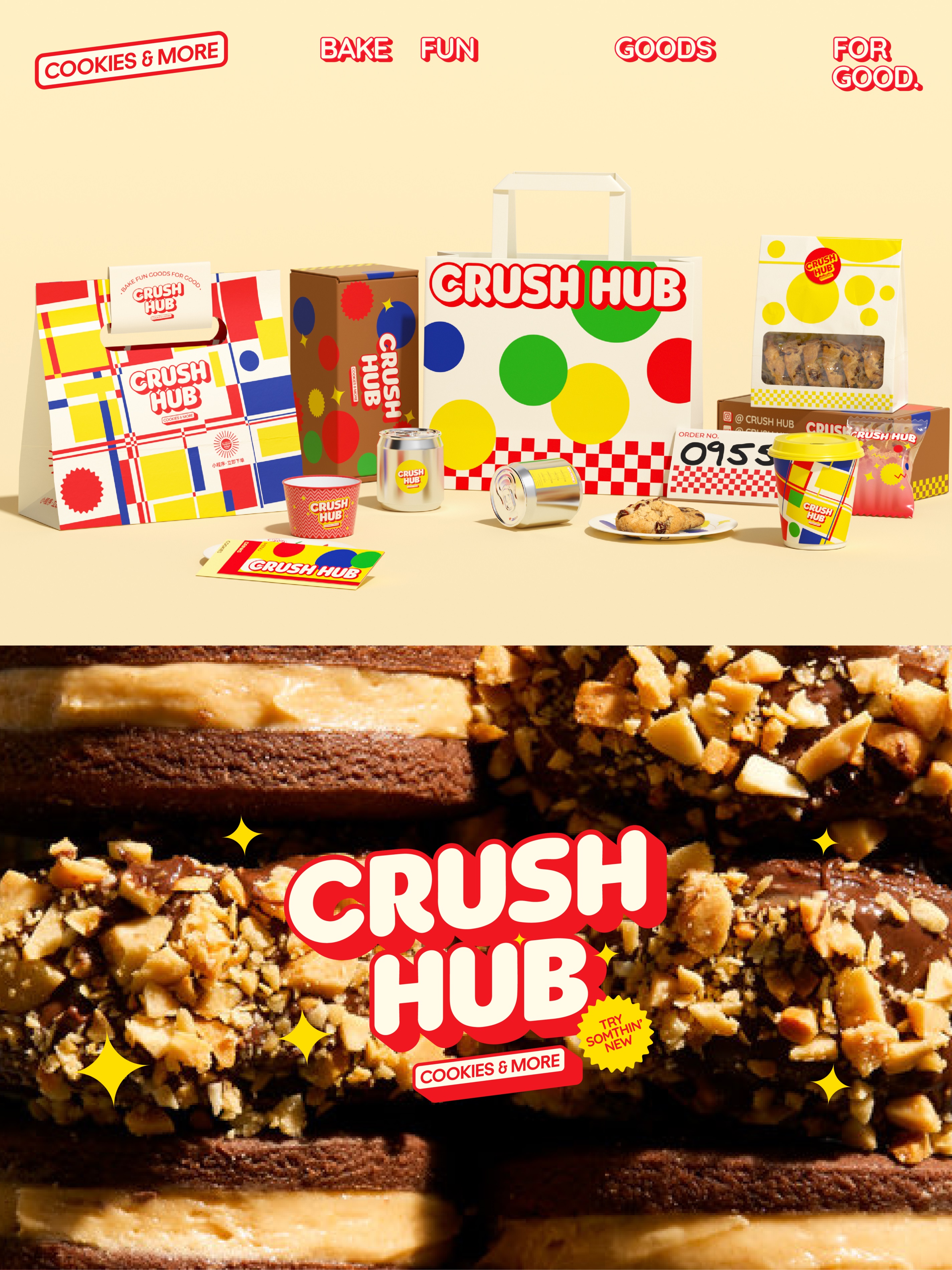
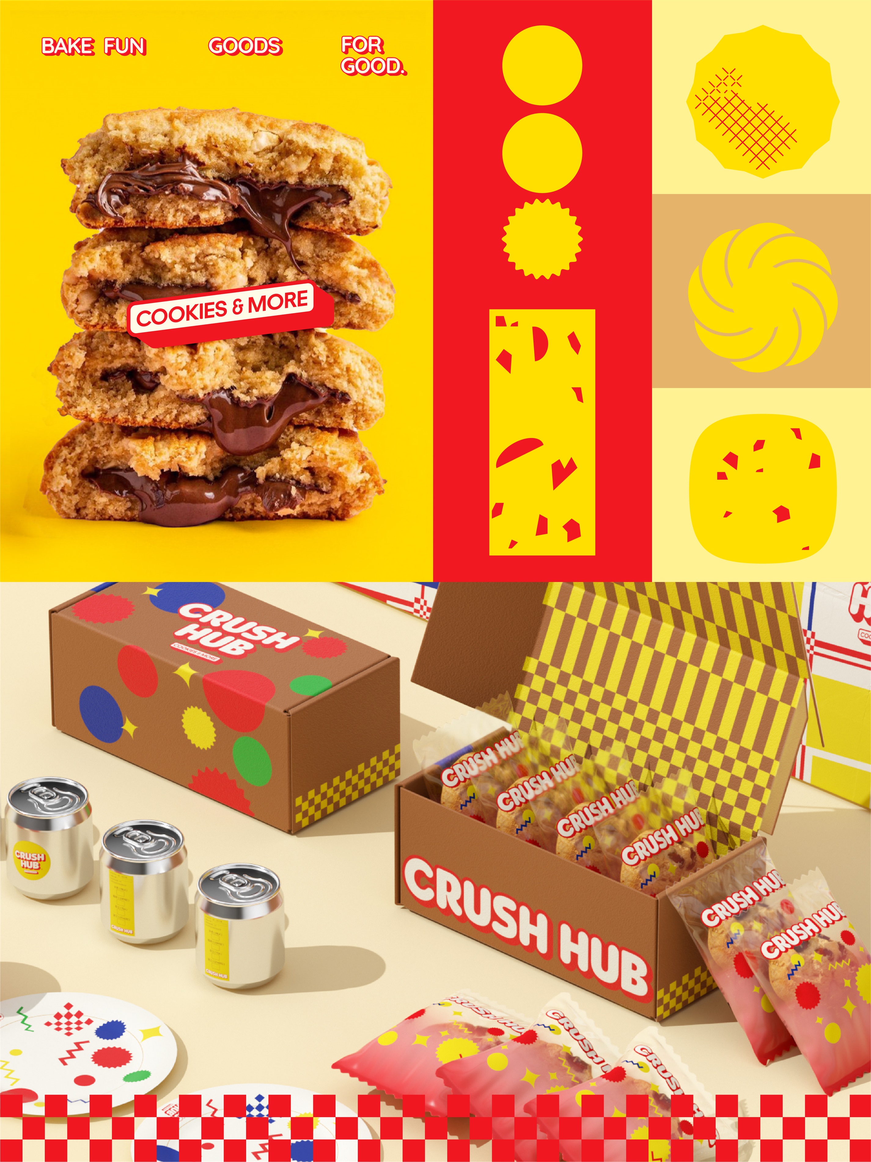
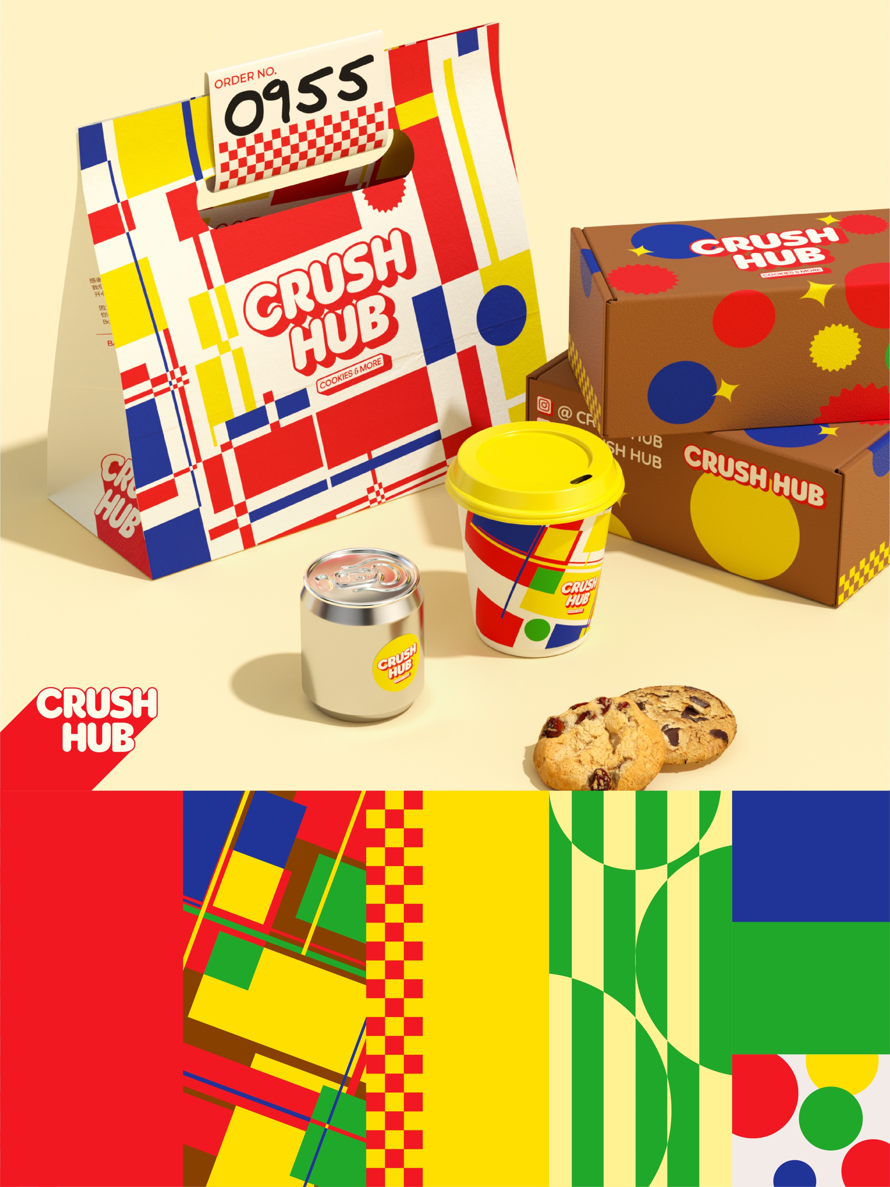
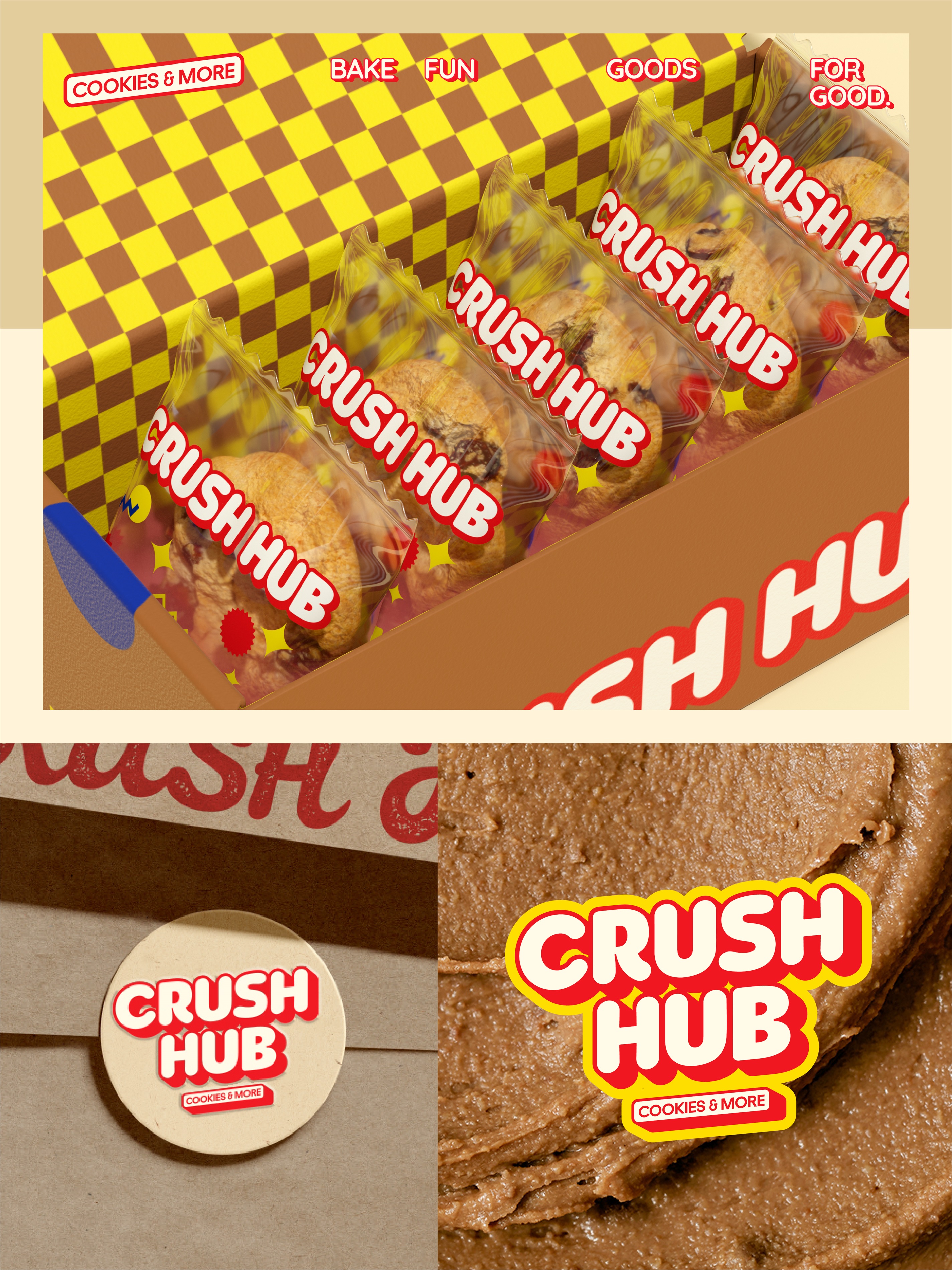
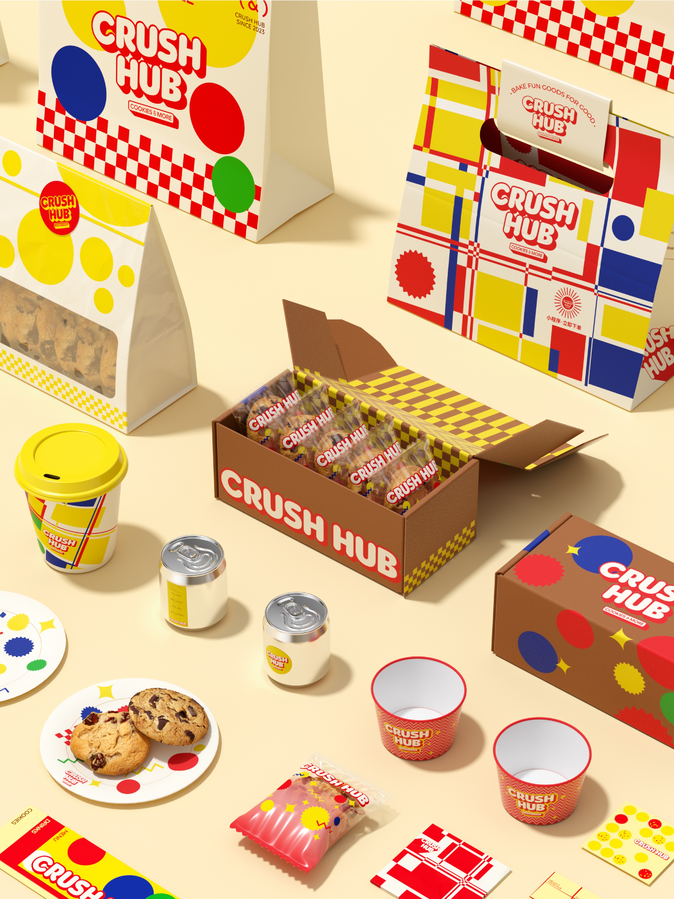
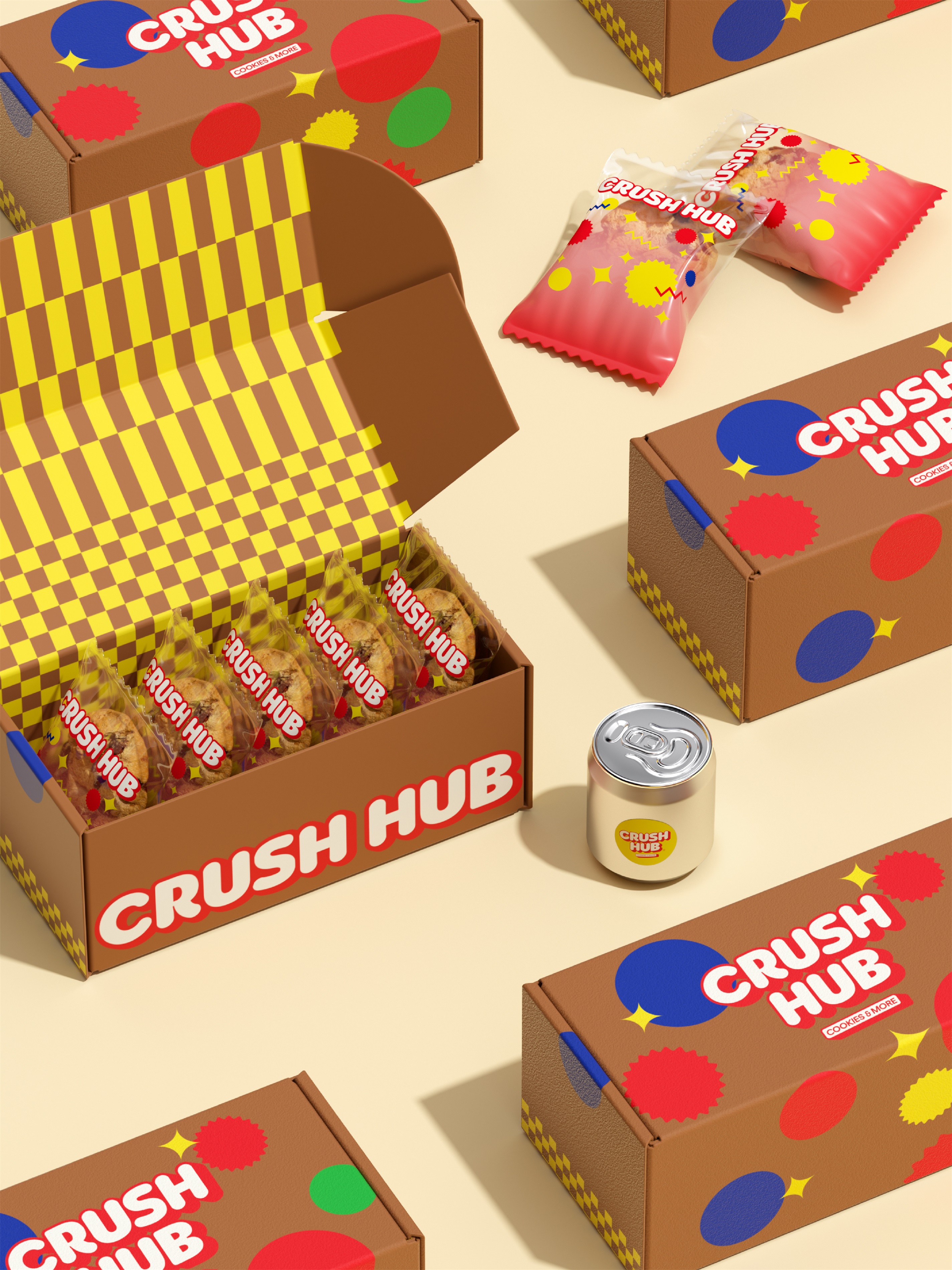
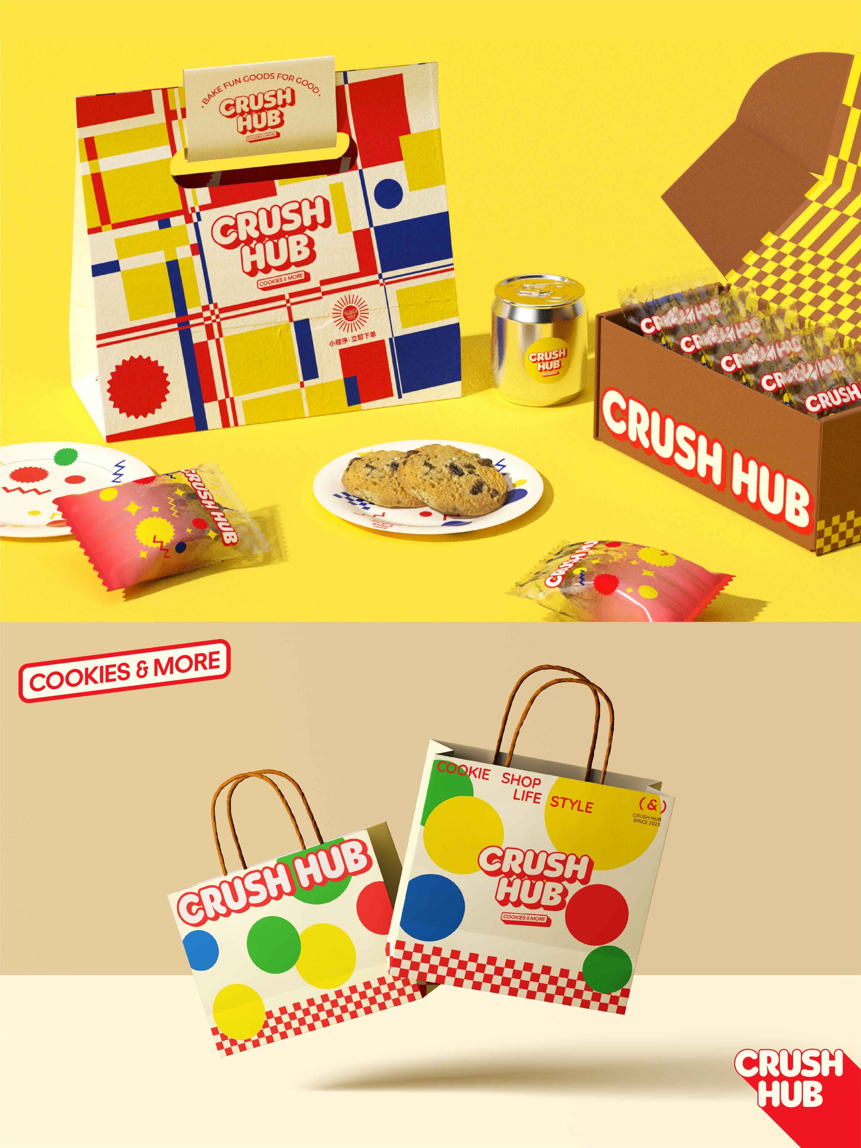
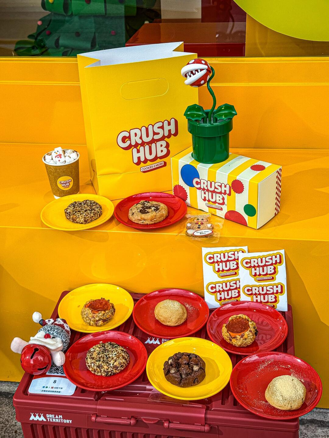
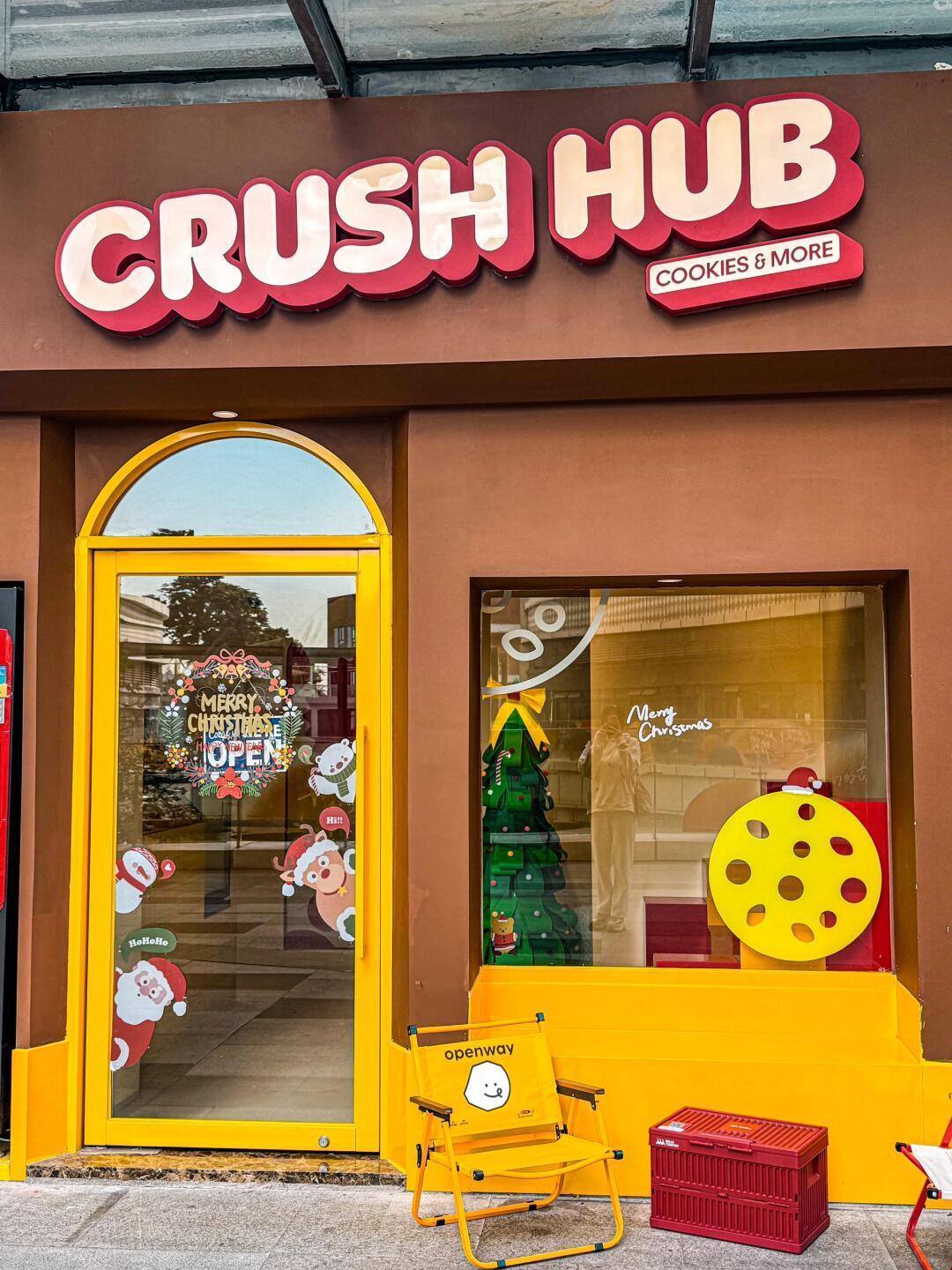
CRUSH HUB is a brand focused on soft cookie baking, and this design creates a brand-new visual identity system (VIS) for it, encompassing brand logo, packaging, spatial signage, and promotional materials to highlight brand personality and enhance recognizability.
The design adopts the Memphis style as its core visual tone, renowned for its playfulness and visual impact. Through unconventional forms and bold color applications, it perfectly aligns with CRUSH HUB’s brand philosophy of “rooted in fun.” This design language enables CRUSH HUB to quickly establish a “fun, playful, and warm” brand image in consumers’ minds, achieving unique recognizability and market differentiation.
The brand logo utilizes a sans-serif font, with its bold yet soft characteristics playing a leading role in visual identity while enhancing brand approachability. In terms of color, high-saturation red and yellow serve as primary colors, complemented by brown and gray, creating an expressive visual effect. Vibrant color block splicing further reinforces the brand’s lively and youthful tone, aligning with CRUSH HUB’s upbeat core philosophy.
In the logo design, framed and shadowed expressions enhance its retro aesthetic. The brand name “CRUSH HUB,” combined with a distressed, letterpress-style noise effect, symbolizes the brand’s desire to emotionally connect with consumers through food during any “CRUSH” or “CRUSHED” moment. This approach conveys handmade warmth while endowing the brand with a distinctive memory point.
CRUSH HUB’s design aims to ensure the brand adapts flexibly to various environments and occasions. To this end, the design team developed multiple visual expressions to create a unique sensory world for CRUSH HUB. This includes tailored promotional materials and packaging designs for traditional festivals, celebrations, or commemorative events, allowing the brand to maintain consistent visual identity while integrating specific themes and atmospheres, thereby enhancing brand relevance and emotional connection with consumers.
In graphic design, chocolate chips on cookies are abstracted and reorganized into polka dot patterns with brand-specific characteristics. Through asymmetrical geometric arrangements and Memphis-style bold lines, a distinctive visual symbol system is established.

Entrant
Rong Jia
Category
Communication Design - Campaigns / Advertising

Entrant
Foshan Dongxiong Home Furnishings Co., Ltd.
Category
Product Design - Furniture