
2025
KUNSHAN RURAL COMMERCIAL BANK: the brand of “know your need”
Entrant
Aijia (Shanghai) Cultural Communication Co., Ltd.
Category
Communication Design - Company Branding
Client's Name
-
Country / Region
China
Gallery

About The Entry
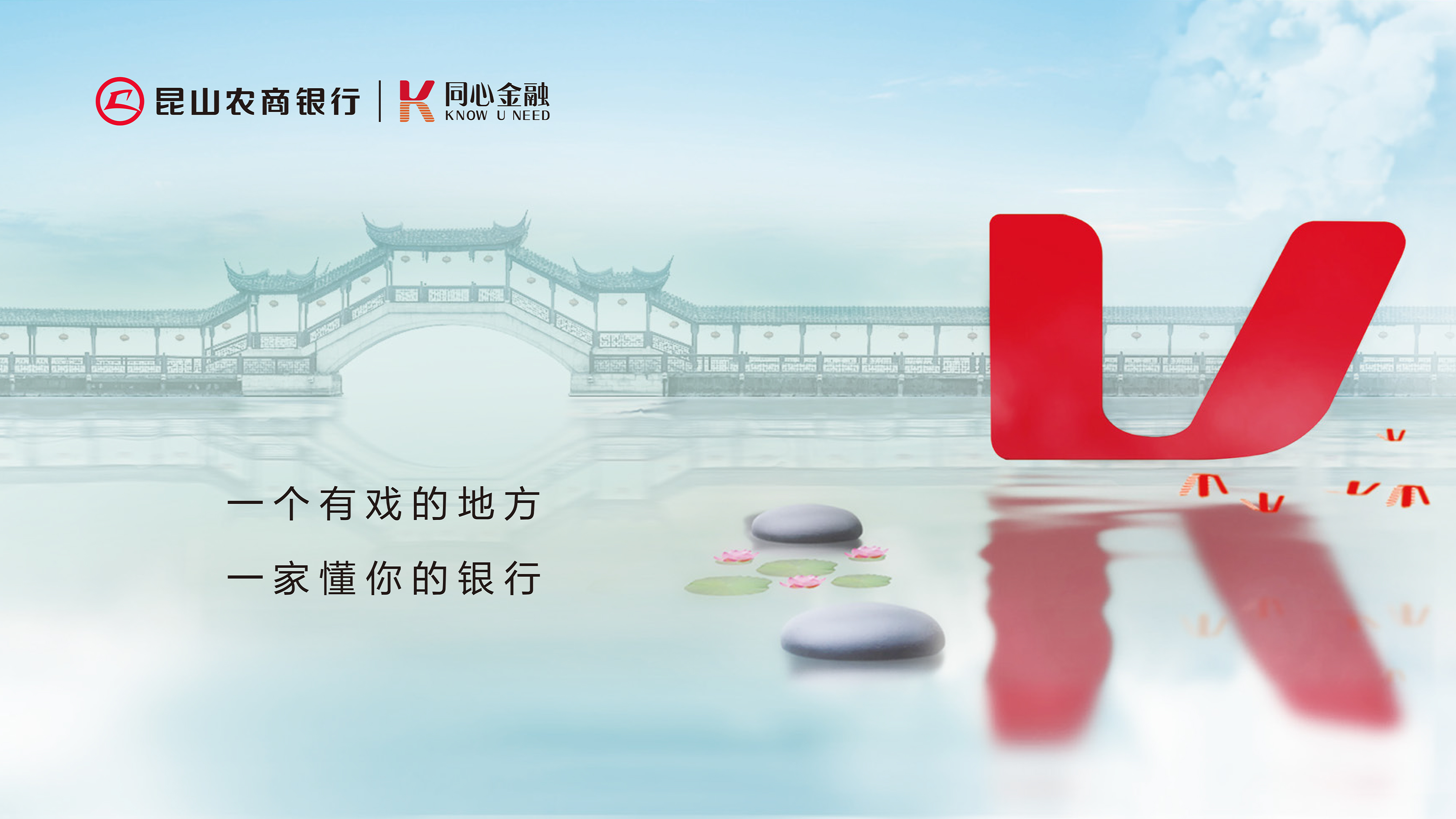
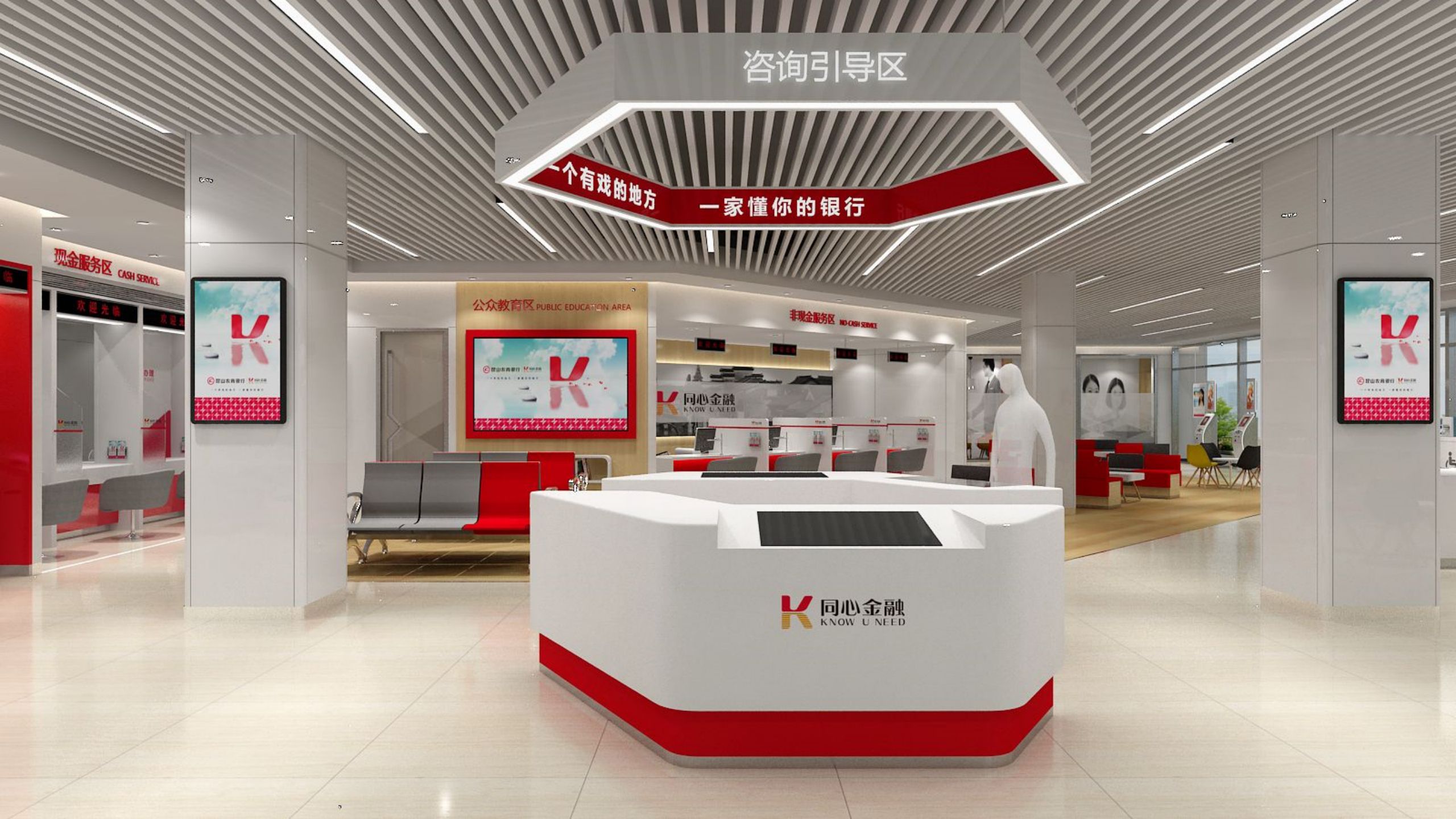
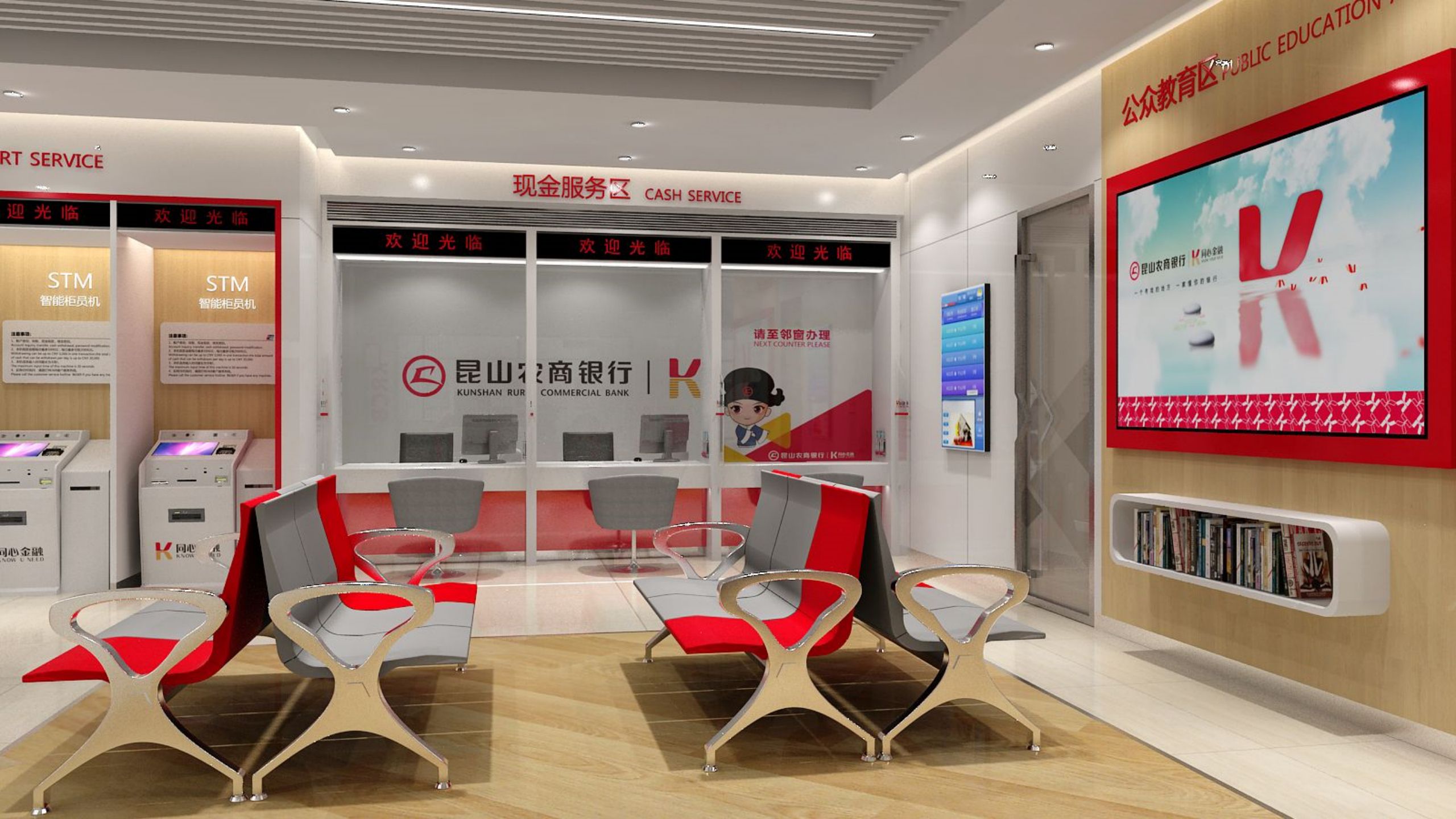
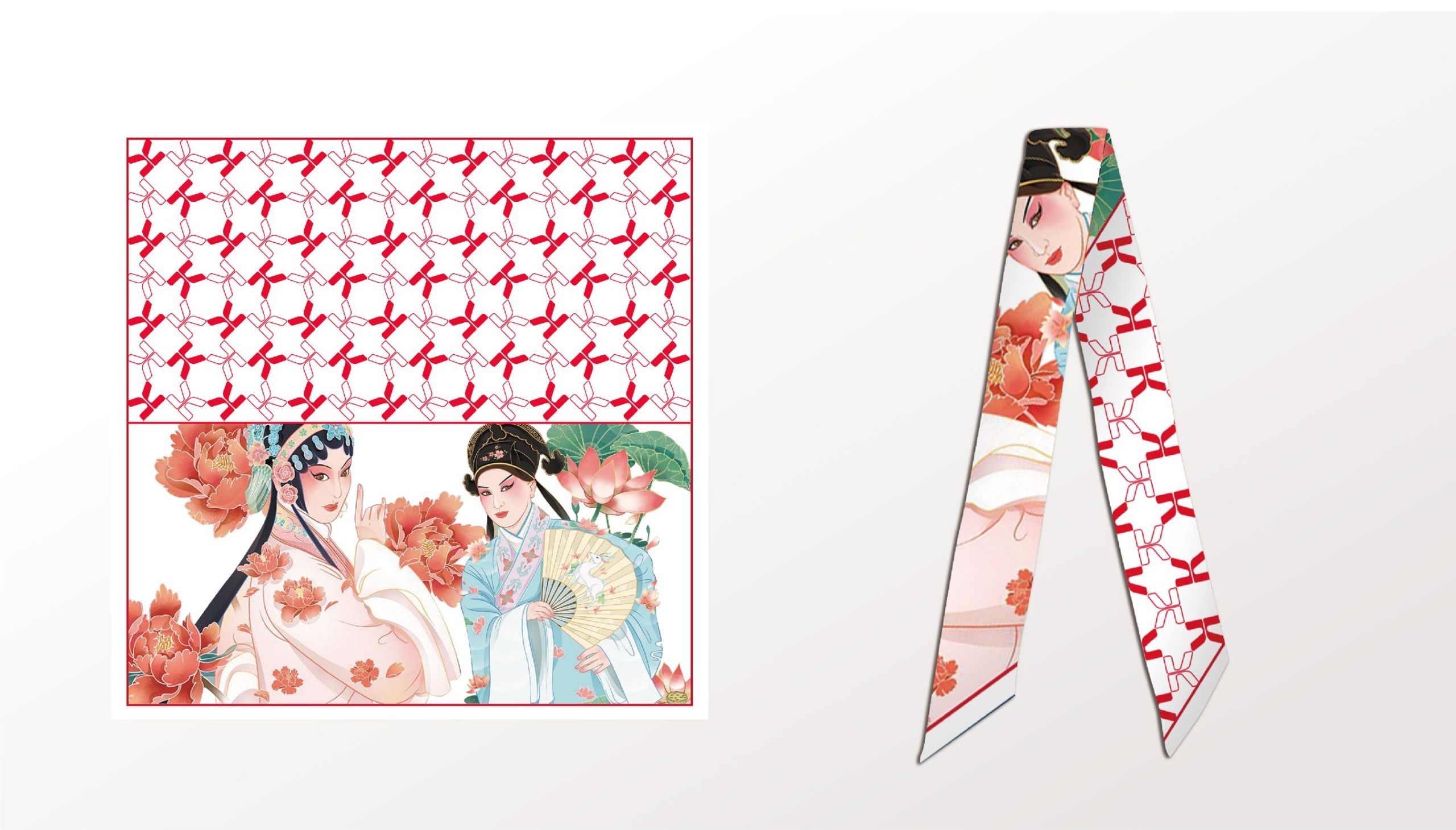
This project presents a distinctive, engaging brand identity for “Know Your Need,” a new commercial brand launched by Kunshan Rural Commercial Bank. Guided by the slogan “A city where opera echoes through time, a bank that truly understands you,” this design draws on Kunshan’s rich cultural heritage to create a brand image with humanistic warmth.
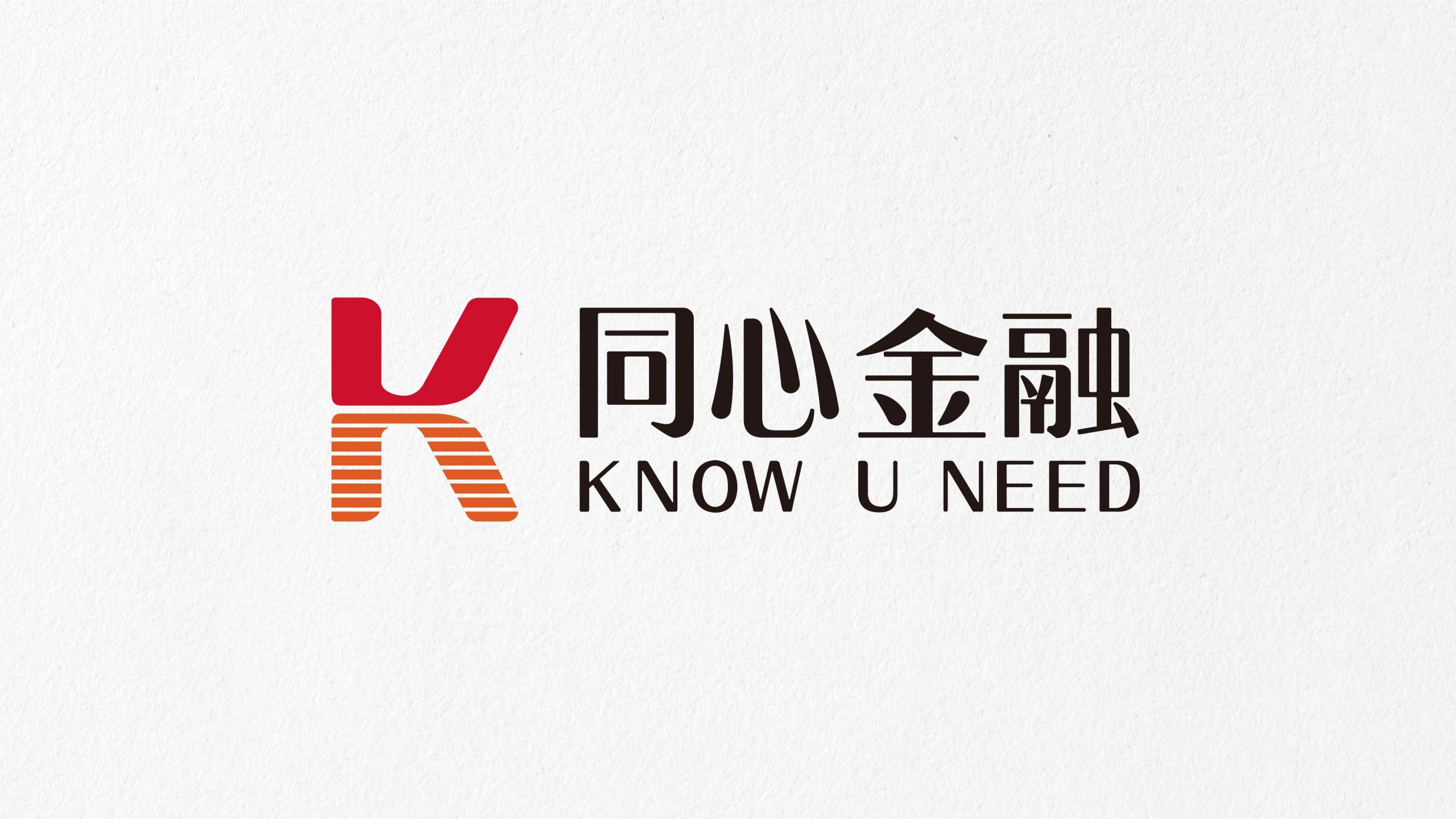
The logo design is innovatively designed for profound symbolic meaning. At its core is the letter “K,” which serves as the initial for both Kunshan Rural Commercial Bank and the brand concept “KNOW U NEED.” This clever dual meaning effectively strengthens the brand identity. The letter “K” is reimagined as two U-shapes that mirror each other vertically, symbolizing the deep, mutual connection between the bank and clients. This visual metaphor powerfully conveys the brand’s philosophy: “Together, we move forward.” Adding to its symbolism, the lower half of the logo is styled as a reflection in water—a tribute to Kunshan’s identity as a southern Chinese city renowned for its picturesque water towns. This reflective element also enhances the visual uniqueness of the brand image.
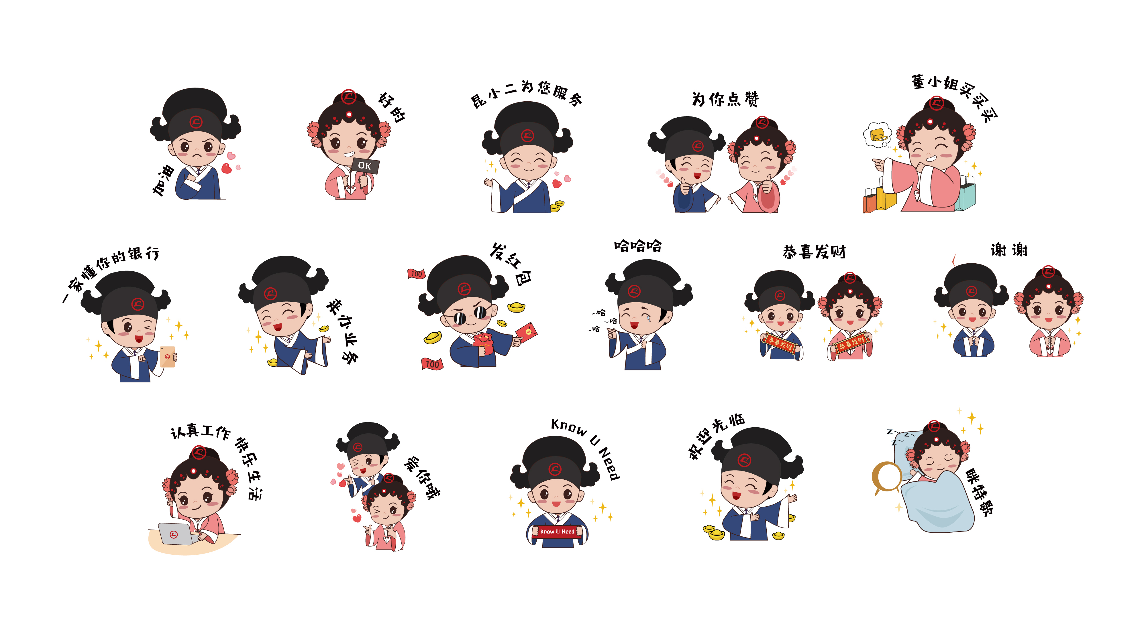
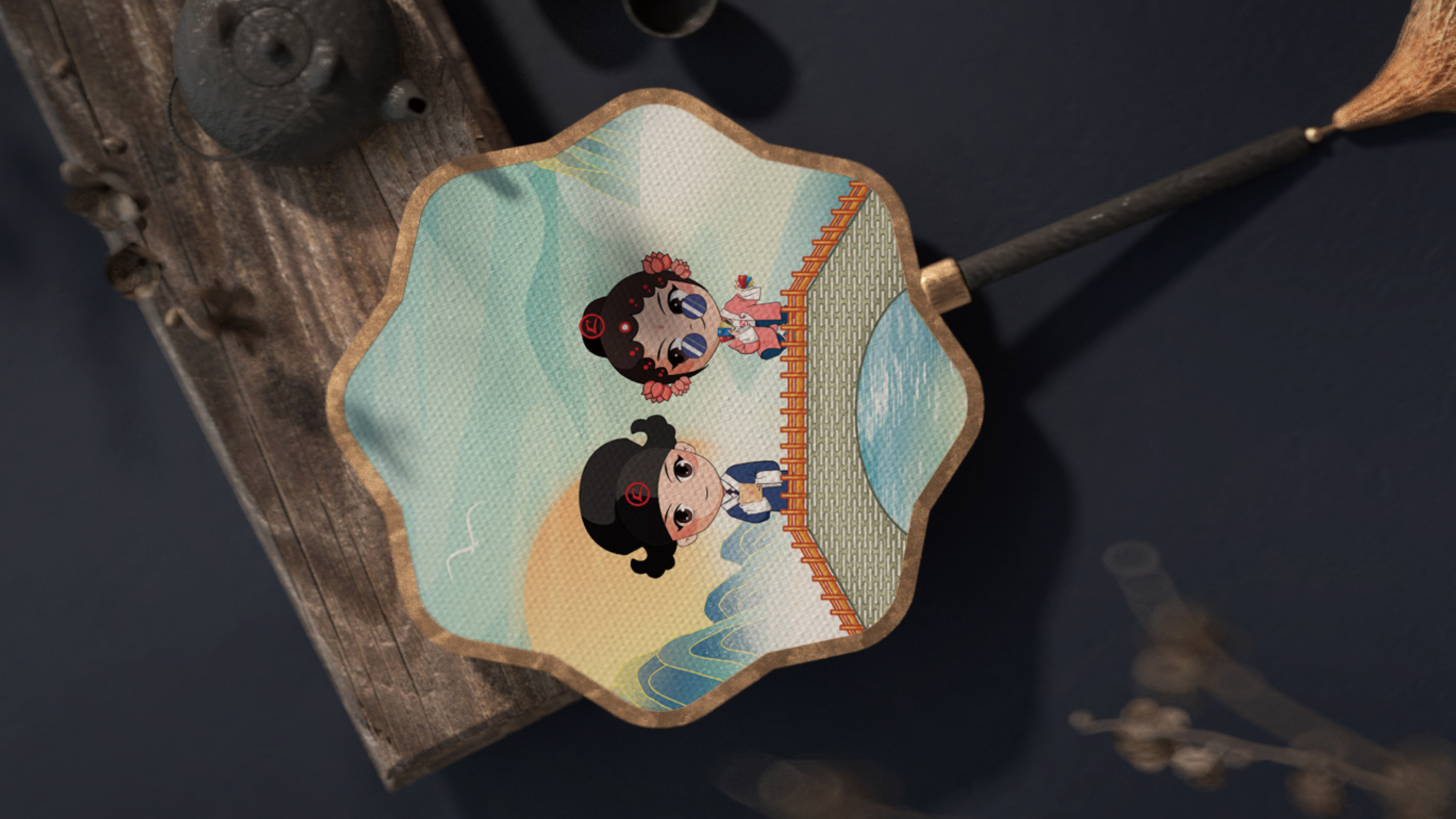
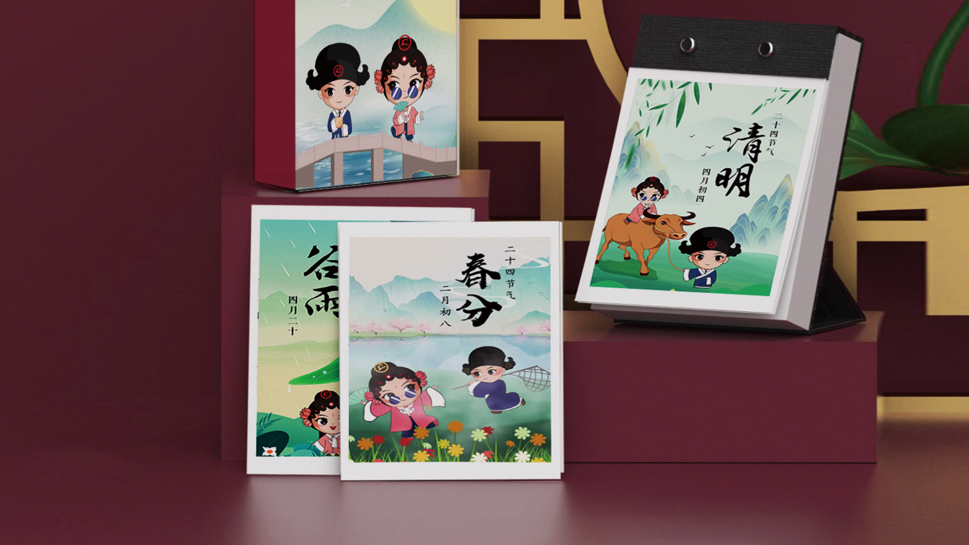
The IP characters, inspired by Kunshan’s iconic Kunqu Opera, feature two personified figures: “Kun Xiao’er” and “Dong Xiaojie.” “Xiao’er” (a traditional term for a waiter) represents the brand’s spirit of dedicated public service, while “Dong” (which means “understanding”) reflects its client-centered philosophy—one that actively listens to, comprehends, and responds to clients’ needs. Drawing from the classic Kunqu Opera roles of “Xiaosheng” (a young male scholar) and “Qingyi” (a graceful and virtuous female figure), the IP characters seamlessly blend the cultural essence of Kunqu Opera with modern design. This thoughtful fusion not only pays homage to tradition but also makes the brand feel more relatable and approachable to the clients. In addition, the brand has introduced a range of cultural and creative products featuring these IP characters, such as emoji packs, cushions, and fans. These offerings help enhance engagement and extend the brand’s reach through diverse digital communication platforms, while also infusing the brand with fresh vitality.
Credits


Entrant
ADA Hong Kong&Pingtan Juji Tourism Investment Co., Ltd
Category
Interior Design - Hotels & Resorts
Entrant
Jiming Bai, Yifan Zhang, Yuejun Han, Yinong Ge
Category
Architectural Design - Rebirth Project