2025
Visual Identity & Communication Platform for Multi-Wing
Entrant
ZITE
Category
Communication Design - Company Branding
Client's Name
Multi-Wing
Country / Region
Denmark
Gallery






About The Entry
Challenge:
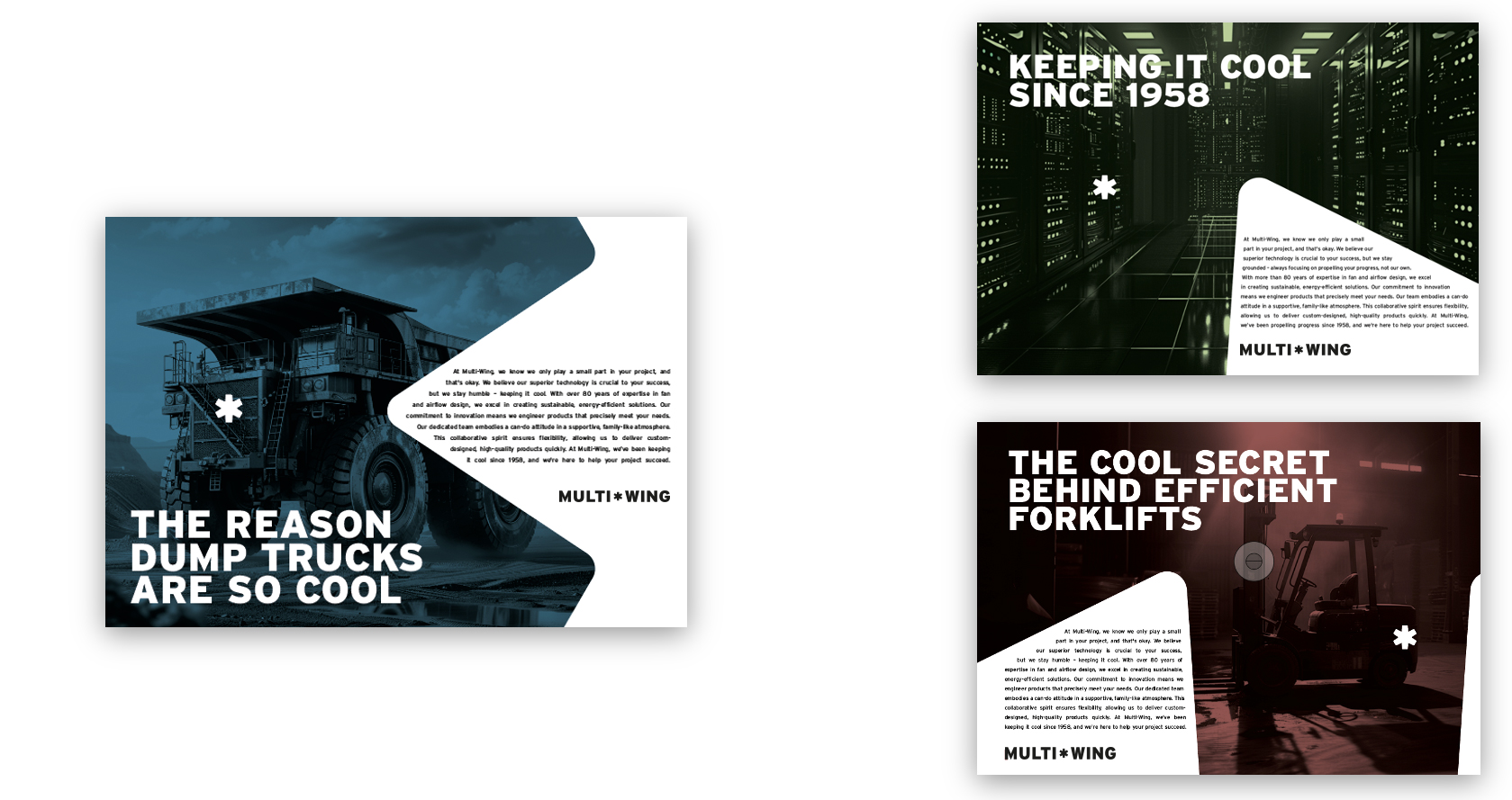
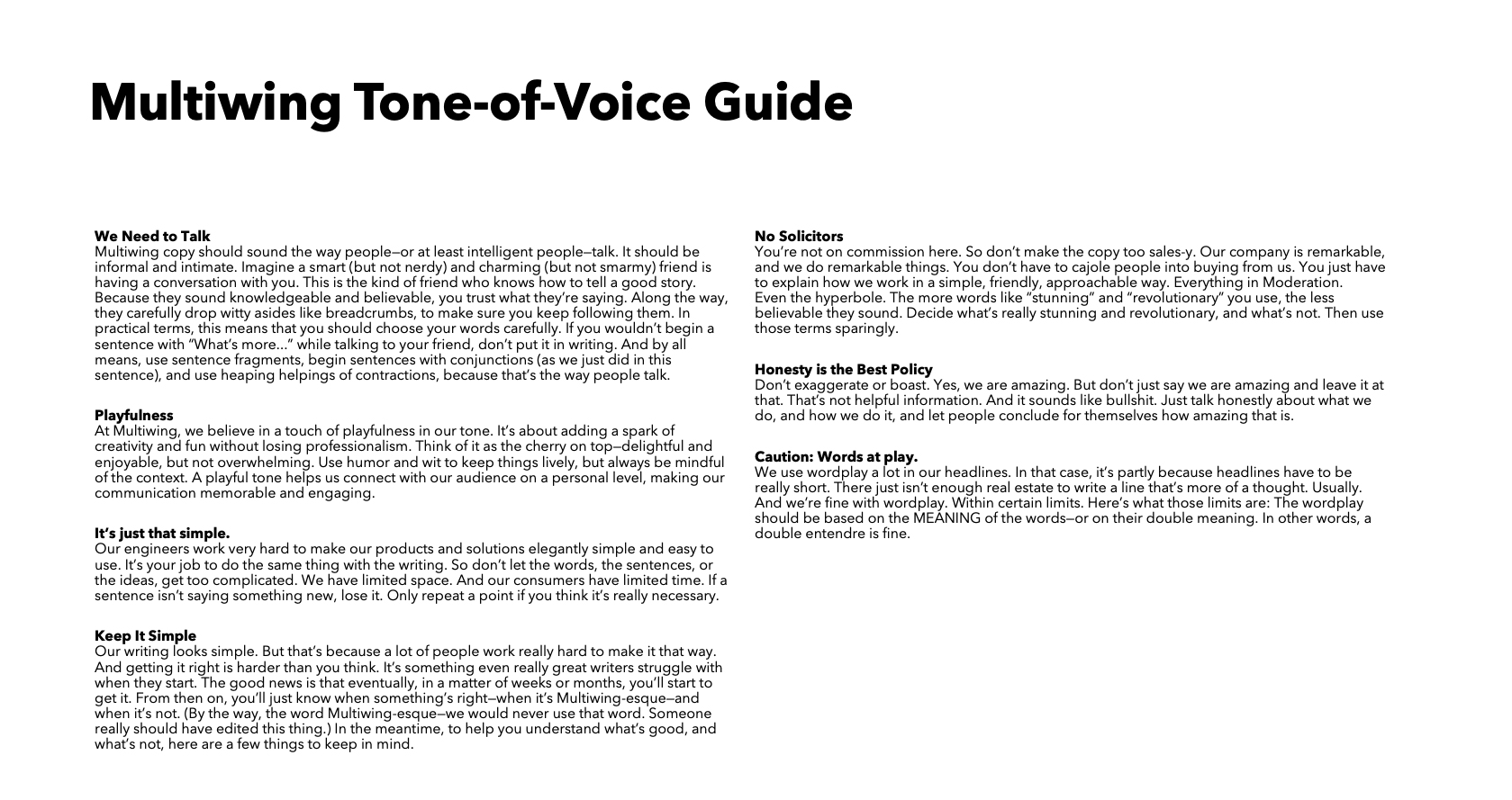
Multi-Wing has been a global leader in axial impellers since 1958. But while their products evolved, their brand identity stood still. Like many B2B brands, their visual and verbal presence had become overly technical and lacked emotional resonance. Our challenge wasn’t just to modernize a logo — it was to reconnect the brand with what made it special: its people, its adaptability, and its engineering excellence. We had to design a future-facing identity without losing the trust built over decades.
Solution:
We approached the rebrand with a clear vision: to create a visual identity that’s modern, flexible, and unmistakably Multi-Wing. Our process began with brand pillars — Human, Flexibility, and Technology — to ground every creative decision in the company’s DNA. These weren’t just abstract values; they were the blueprint for how we spoke, looked, and acted.
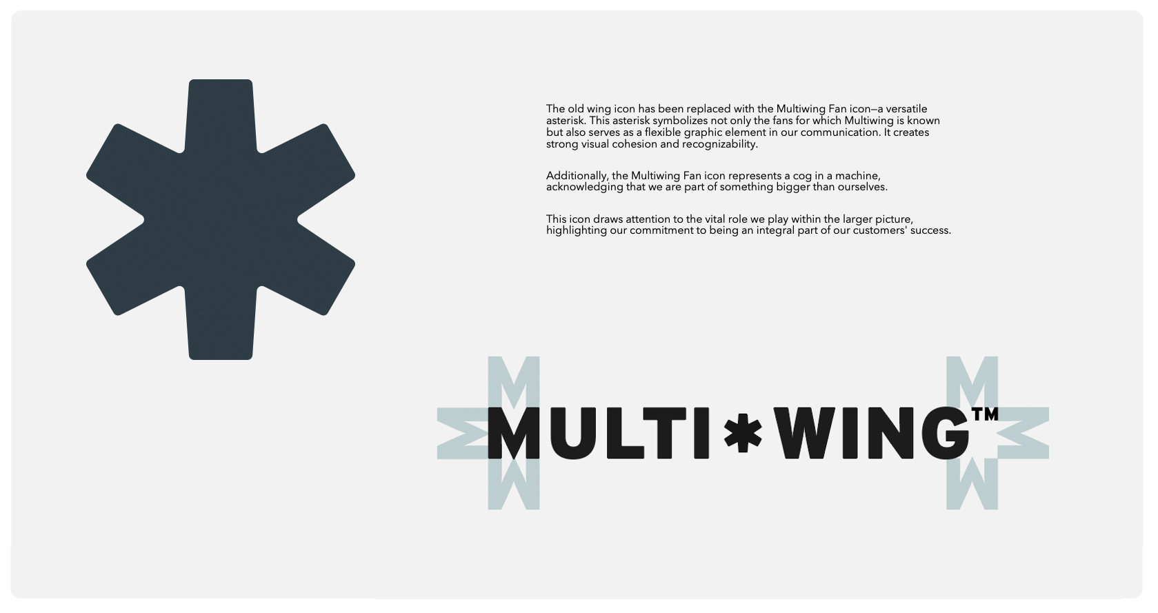
At the heart of the new identity is the Multi-Wing Starlet — a bold, modern reinterpretation of the brand symbol. It’s not just a logo. It’s a visual metaphor for airflow, movement, and the modular flexibility that defines their product. Paired with a refined tone of voice that is both intelligent and human, we stripped away the jargon and found a voice that’s clear, warm, and quietly confident.
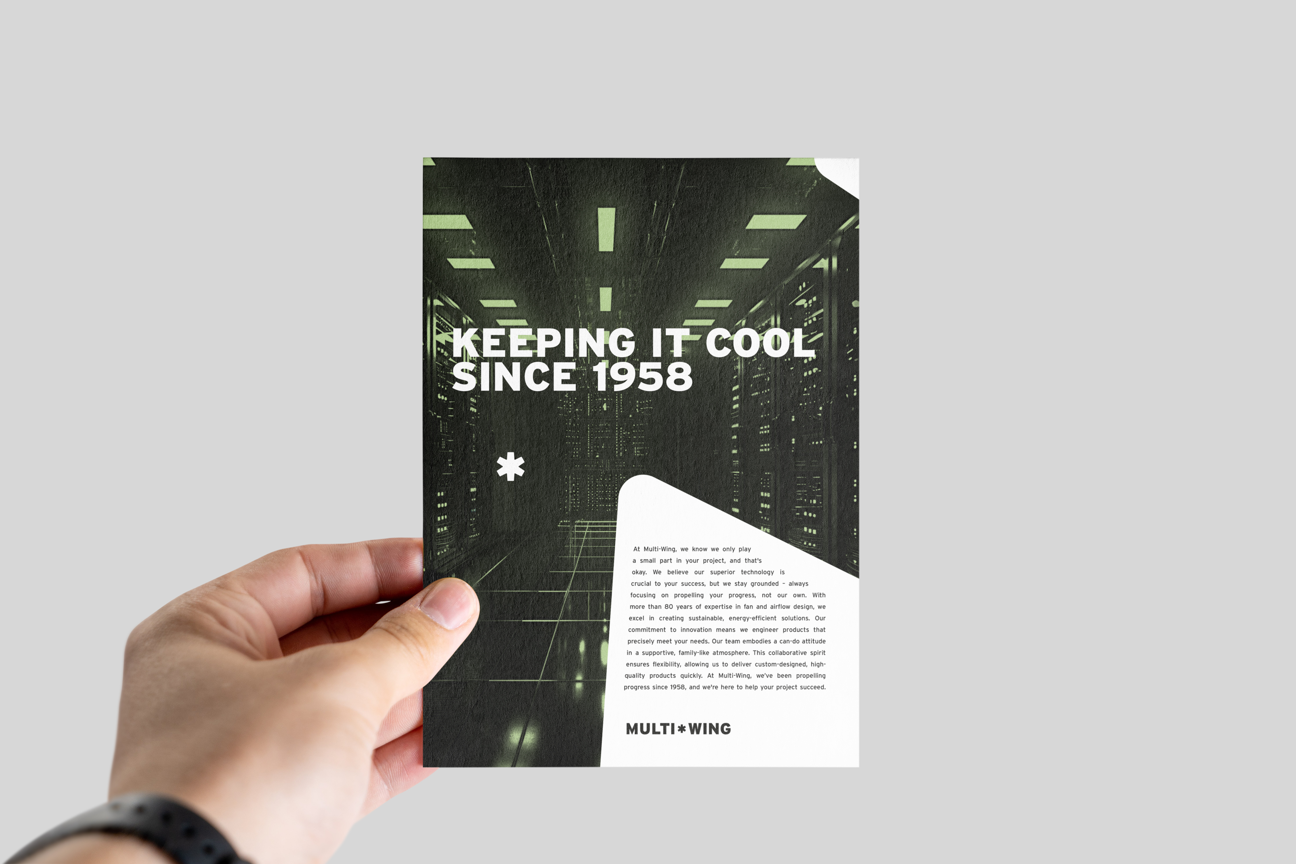
Everything from typeface to tone was selected to reflect Multi-Wing’s dual nature: engineered precision, delivered with a personal touch.
Result:
The rebrand has already sparked momentum. We've seen increased traffic to our booths at key industry events — proof that the new identity turns heads in a traditionally conservative category. The refreshed brand has also become a strong conversation starter, opening up new dialogues with customers and partners who now see Multi-Wing in a different light. Internally, it’s become a source of pride and clarity. Externally, it proves our point: in B2B, neither B stands for boring.
Credits
Entrant
National Cheng Kung University
Category
Product Design - Bio-Solar Smart Lighting & Environmental Installation

Entrant
Guangzhou Chenfeng International Trading Co., Ltd.
Category
Fashion Design - Lingerie / Intimates
Entrant
Underdog Kitchen Company
Category
Product Design - Kitchen Accessories / Appliances