2024
Vytala Corporate Logo/Identity
Entrant
SFC Group
Category
Communication Design - Company Branding
Client's Name
Vytala
Country / Region
United States
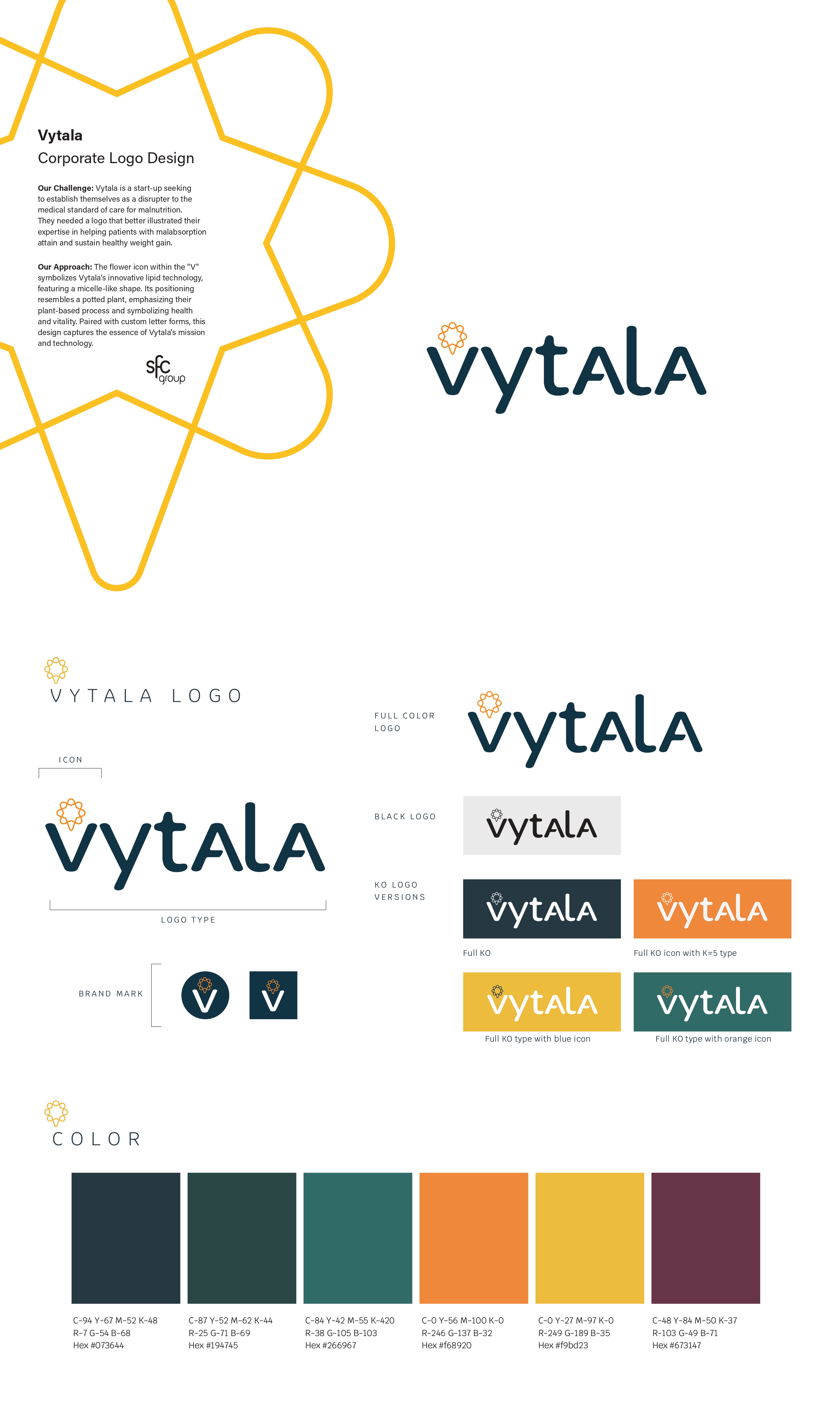
Vytala Health is a start-up seeking to establish themselves as a disrupter to the medical standard of care for malnutrition. They needed a logo that better illustrated their expertise in helping patients with malabsorption attain and sustain healthy weight gain.
The flower icon within the "V" symbolizes Vytala’s innovative lipid technology, featuring a micelle-like shape. Its positioning resembles a potted plant, emphasizing their plant-based process and symbolizing health and vitality. Paired with custom letter forms, this design captures the essence of Vytala's mission and technology.
Entrant
Yuxiang Qi, Yicheng Zhao & Xiaoheng Li
Category
User Experience Design (UX) - COVID-19-Related
Entrant
Product / Interactive Designer
Category
Conceptual Design - Interaction